Typeface of the month: Mrs Eaves
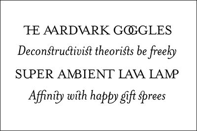
This is something I’ve been meaning to do for a while now. Every month, from now on, there will be a typeface of the month. They’ll be chosen by me because either I like them, they’re new, they’re classics or I hate them. Should be fun. So, first up is quite possibly my favourite serif typeface: Mrs Eaves, designed by Zuzana Licko for the Emigr? Type Foundry.

Mrs Eaves is a revival typeface, a recreation of a classic, in this case Baskerville. Baskerville is a great typeface, although criticised, like a lot of serif faces designed at that time, for being too sterile - too hard. this, I feel, was a reaction to the poor printing processes and paper of the time. Times Roman (not ‘New Roman’) for example has hard serifs to allow for bleed onto poor qulity paper, therefore softening the serifs. Baskerville is no different in this respect. So, when Zuzana Licko set out to create a typeface inspired by Baskerville her main objective was to create a softer, more open typeface.
An aspect of Baskerville’s type that I intended to retain is that of overall openness and lightness. To achieve this while reducing contrast, I have given the lower case characters a wider proportion. In order to avoid increasing the set-width, I reduced the x-height, relative to the cap-height. Consequently, Mrs Eaves has the appearance of setting about one point size smaller than the average typeface in lower case text sizes.
I think she achieved this and to my eye, a more feminine looking typeface (maybe I’m being influenced by the name there?). Mrs Eaves, when set in a large amount of body copy, is incredibly legible but, when compared to similar typefaces such as Caslon or Garamond, there is a feeling of lightness to the page, rather than the heavy appearance of the aforementioned typefaces.
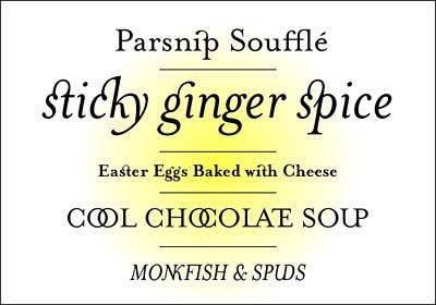
Ligatures? Oh yes!
What makes Mrs Eaves stand head and shoulders above the rest is the Ligature Set available.

Mrs Eaves ligatures look superb when set at small or large sizes, either as body copy or headlines. they really add something very distinctive. Unfortunately, Mrs Eaves suffered the same fate in the late 1990’s as Template Gothic did in the early 1990’s - chronic, and often inappropriate, overuse. Shame really. I never stopped using it though - I even used it for my wedding invitations!
So, there we have it. A classic revival with some lovely ligatures. 8 out of 10.
Tags that this post has been filed under.