New Drop Caps
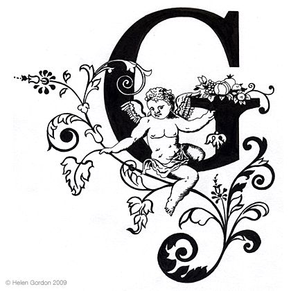
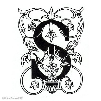
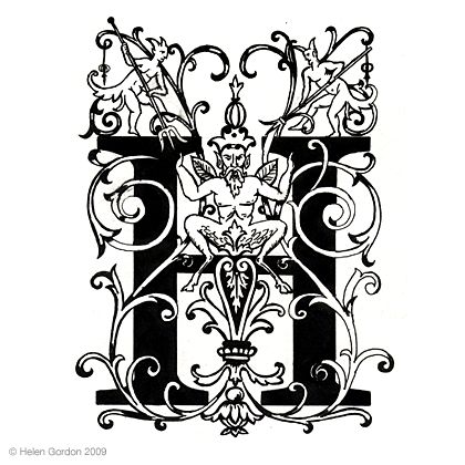
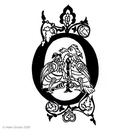
When I redesigned this blog a little while ago, the drop caps I used were always going to be a placeholder. Following an evening with my Sister-in-law–who happens to be a textile designer/illustrator by training–I commissioned her to produce a complete uppercase alphabet based on Georgia. I’m thrilled that two months later, they’re live on the site. (if you’re reading this on RSS, then pop on to the web to see what you’re missing).
The brief was pretty simple. I wanted illustrative drop caps produced that were aligned to the inspiration for this design; namely Renaissance illustrations and carvings. They ended up being slightly broader in inspiration than that though. They’re hand painted on thick, textured cartridge paper in black ink.
I planned on interviewing Helen (and I still plan on doing that), but I just couldn’t sit on my hands until then. Here’s a few letters that are particular favourites of mine. Interview coming soon…


Tags that this post has been filed under.