Web Directions & Typographic Structure
Last week I presented at Web Directions South 09 here in Sydney, Australia on Font Embedding and Typography. It’s a talk I gave at @media 09 in London over the summer. I enjoyed giving the presentation - despite AV problems which resulted in a ten minute reduction in time allowed and having to give the presentation without notes. But the show went on.
But despite that single hitch, Web Directions was quite possibly the best web conference I’ve been to. I was congratulating John and Maxine at a speakers BBQ on the Sunday following the conference, and it became evident it was down to their undying attention to every, single little detail, from the moment you register to the food you are served (which was excellent by the way). But the lasting memory for me was the buzz of the Australian web industry. It was very refreshing to visit a country not in recession and see an industry thriving on creativity rather than suffocating beneath a blanket of uncertainty.
But anyway, before this turns into a rant about politics, back to the presentation…
This was not a practical presentation full of hints and tips or a presentation about fonts. Or font embedding. Even though I touched on these two subjects briefly, this was a talk about typographic design and all of the aspects of the craft that I find important and how I relate to them in particular to this medium.
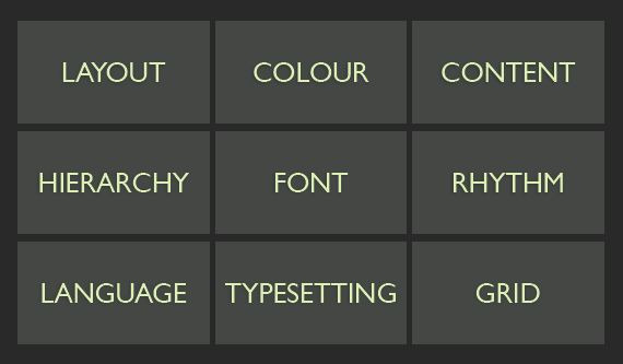
A core part of the presentation describes my understanding of typographic design and why font choice is only one of nine aspects that need to be considered when designing with type on the web. This is the third model of typographic design I’ve been working through now, and not only is it sticking, but as I’m beginning to explain it to other people, I’m not having to change it too much. It has almost passed the mother-in-law test. For me, it’s working as a way to explain what I do and I’d like to share it to get your thoughts.
Typographic Structure
Typographic design, as I understand it, involves nine elements:
Language
Language is entwined with typography. Type can be defined as the display and arrangement of language. As designers, we should care about this.
Typesetting
Typesetting is the process of taking raw text and marking it up. Making headings, lists, emphasised text etc.
Grid
The typographic grid is a foundation upon which layouts can be built.
Hierarchy
Conceptually, content has levels of importance. Typographically, Hierarchy visualises this.
Font
The font used to display the content.
Rhythm
How the arrangement and layout of the type aids reading.
Layout
Combining type with other graphic elements such as photographs, illustrations, video or other UI elements.
Colour
Colour, when discussed in typographic terms, can mean two things: red, green, blue etc. or dark or light typographic colour. Dark typographic colour is dense type–tight leading or line height, tight whitespace. Light typographic colour is the opposite.
Content
One of the unfortunate things on the web is that, generally, we’re designing not knowing what the content is. We have an idea of what the content might be, but when dealing with content management systems and the flow of data, it’s very difficult to know. But content is an important part of typographic design and this connection is one of the casualties of the web standards mantra of separating content and presentation. When we do that, it’s very difficult to tell stories with design.
Here’s a diagram:

As you can see, your choice of font only plays a small part in the overall typographic considerations. Of course, on the web, we’ve had our choices here limited to the point of almost removing the element of choice. And don’t forget that a number of these elements are also completely in the hands of the user to change at their will.
My point is this: font choice is only part of what makes good typographic design. The limitations that have been imposed on us–with only a hand full of fonts guaranteed on user’s machines–have nurtured fairly good typographic craft on the web. Generally, we care about the content; we mark it up with the correct intended hierarchy; some us care about typesetting ampersands, or bulleted lists. I’m not sure that the same level of care and attention is employed by some of our print cousins (and I say this having spent quite a few years on that side of the fence). Why is this? Well, designers are like magpies; we get distracted by the shiny.
When I was in university, I sent off for every type specimen sheet I could get my hands on. I pestered everyone from Monotype to Emigré. Receiving the canvas bags stuffed with font supplements from T26 was certainly a highlight of my first year. Why? Well, firstly, type supplements are normally beautiful things. They didn’t necessarily make me look at type any differently, but they made me want to collect type. I’m sure that mindset isn’t that rare in anyone who cares about type, but it’s a mindset that leads to a shallow understanding of the broader craft. You get distracted by the next beautiful typeface. You’re constantly on the search for the typeface that is just right.
Font choice is not the most important decision you make when designing with type. On the web, currently, it is way down on the list because of the constraints of the medium. With commercial font embedding just around the corner, we stand on the edge of an incredibly exciting time for the typographic web. In eighteen months time, I think the web will be starting to look very different. And about time too, but let’s not get distracted by the shiny.
Tags that this post has been filed under.