Rethinking CSS Grids
Off the back of this article in Net Magazine last week, and the subsequent few tweets popping up in my stream, I’ve finally managed (in no small part from the help of Nathan and Alex) to pull together some of my thoughts and concerns regarding CSS grids and how they could (or, maybe, should) be created.
What's there at the moment?
Multi-Columns
CSS Multi-Column is really simple. Basically, you divide a element into columns. This is already well-supported in many modern browsers.Flexible Box Layout
Flexible Box Layout is a module that automatically resizes elements within another element without having to do a lot of painful maths.Grid Layout
Let's concentrate on Grid Layout, as this is potentially the most designer-friendly and should match existing mental models.The issues with Grid Layout
How grids are constructed
The underpinning unit of measurement in a grid is The Module. From that starting point, Modules are combined to create columns and fields. Grid Layout doesn't acknowledge the existence, let alone use, of the Module. Instead it dives straight into columns and rows. Which brings me on to my second point:Nomenclature
grids have been around for quite a while and there is established words for things like Columns, Fields, Modules and Gutters. It's my feeling that the CSS grid module should speak the same language as designers, not that of developers.A proposal for change
1. Start with a module
The starting point for any grid system is defining your module size. The module has also been referred to as a unit. I’m using module for reasons that will become clear.
To summarise, a module is a repeated rectangle, with gutters in-between, that, when combined, form columns and fields. A module size should rarely be defined, but derived from a fixed, knowable constant to be designed with: image sizes, ad units, video sizes, to name a few examples.
Following the Grid module’s syntax, firstly we define our container div to display as a grid:
div {
display: grid;
}
I then define my grid module with ‘grid-module’ as 50 pixels wide, and 30 pixels high:

div {
display: grid;
grid-module: 50px 30px;
}
This of course be defined in percentages, or Ems:
div {
display: grid;
grid-module: 8% 2%;
}
A new unit of measurement, defined once.
This is why I'm not using the terminology of unit for the module: in a grid system, the module is a unit of measurement. You combine and align content based on modules.Similar to the Em, the Module becomes a user defined unit of measurement. And I’m proposing that we use that new unit of measurement to build our columns and fields.
2. Define the gutters
The next thing we need to do when building a grid is defining the gutter widths and heights. Please note, there, that gutters are also the horizontal spaces between units as well as the vertical.
For this example, I’ll stick to something simple, like 21px.
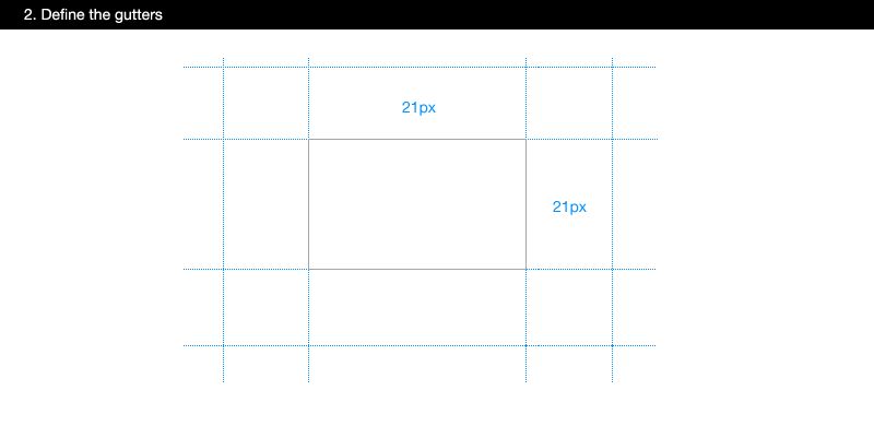
div {
display: grid;
grid-module: 50px 30px;
grid-gutter: 21px;
}
There’s a reason for the 1. Quite often, you may want to visually separate columns of content with a keyline; a line that runs vertically in the middle of a column. If your gutter is an odd number, with an even number of pixels either side of it, it means that 1px is available for the keyline. The syntax for this could be similar to border:
div {
display: grid;
grid-module: 50px 30px;
grid-gutter: 21px;
grid-gutter-keyline: 1px solid #333;
}
Of course, this keyline would be on every, single module - both horizontal and vertical. We would, of course, have to add this to columns and fields.
3. Define your x count
A module is modular. Meaning it is repeated, both on the x-axis and the y-axis. We know that the y-axis is difficult to work with on the web due to content reflow. We just can’t control that vertical height yet. But, we can, and do, define the x-axis.
We use ‘grid-x-count’ to define the width of the grid. And this is the first time we introduce our new unit of measurement; The Module, or ‘md’. In this example, our grid is 10 modules wide, or ‘10md’
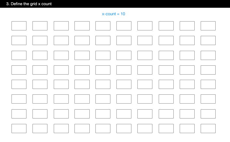
div {
display: grid;
grid-module: 50px 30px;
grid-gutter: 21px;
grid-x-count: 10md;
}
Now, all you need to do to see your grid is to add a background colour to the module:
div {
display: grid;
grid-module: 50px 30px #ccc;
grid-gutter: 21px;
grid-x-count: 10md;
}
4. Define your columns
Next in the process of designing a grid is defining your columns. Now, you should have a pretty good idea of these from how your derived the Module. For this, I’m using the same syntax as the existing proposed Grid CSS3 module. But, for me, the exciting thing is, I can now use the new ‘md’ unit of measurement to define the width of my columns. So, let’s say I want to create a column 2 modules wide on the left, 1 module wide on the right, and then a centre column of the rest. The ‘fr’ unit here is defined in the existing Grid Layout specification:
I add the ‘grid-columns’, with the first column as ‘3md’.
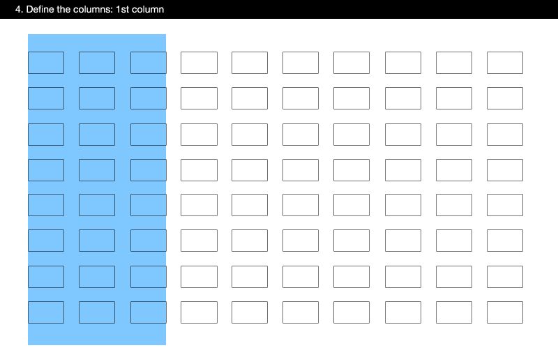
div {
display: grid;
grid-module: 50px 30px;
grid-gutter: 21px;
grid-x-count: 10md;
grid-columns: 3md;
}
The second column sees the introduction of a second proposed new unit: ‘fr’ - short for ‘fraction’, which is proposed in the existing Grid Layout proposal.
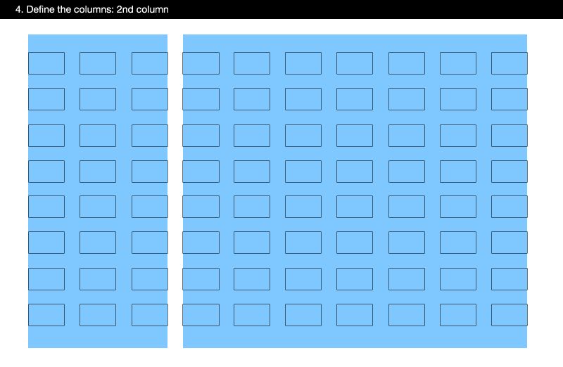
div {
display: grid;
grid-module: 50px 30px;
grid-gutter: 21px;
grid-x-count: 10md;
grid-columns: 3md, 1fr;
}
Finally, I add the last column of 2md wide:
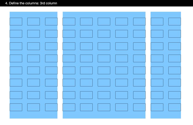
div {
display: grid;
grid-module: 50px 30px;
grid-gutter: 21px;
grid-x-count: 10md;
grid-columns: 3md, 1fr, 2md;
}
That’s my columns sorted. Now, I need to add the horizontal fields. How we might use these fields are for things like headers, content areas and footers.
5. Define your fields
We add the fields in the same was as the columns: using our new ‘md’ unit. Now, you may well ask: ‘why can’t I just use pixels for the height of my header?’. Well, you could, but then you’d have limited connectedness to the underpinning grid structure. As such, you header might not feel like it belonged to the other things on the grid. A grid, after all, is about creating unity.
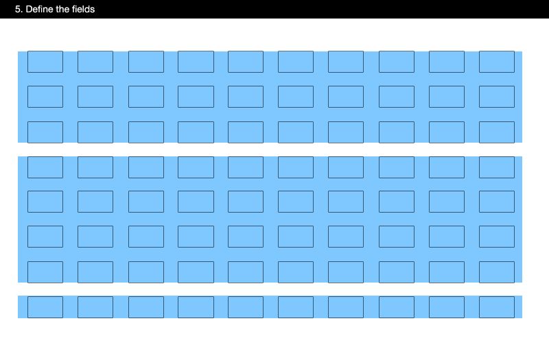
div {
display: grid;
grid-module: 50px 30px;
grid-gutter: 21px;
grid-x-count: 10md;
grid-columns: 3md, 1fr, 2md;
grid-fields: 3md, auto, 1md;
}
So now we have our grid. Three columns and three fields, but all built upon a new user-defined unit of measurement: The Module.
Some nice to haves
There are other things that I would find useful for a CSS grid module to provide. How cool would it be for CSS to be able to give you pain-free baseline grid?
1. Baselines (vertical rhythm)
A baseline grid provides vertical rhythm within your grid, so that type and images align across columns. It’s possible at the moment, but fragile. Wouldn’t be great if it were a simple declaration that magically applied a baseline grid so that all elements would vertically snap to it?
I’m thinking something like this:
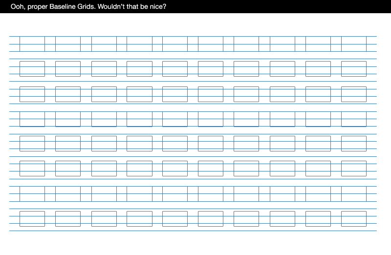
div {
display: grid;
grid-baseline: 1em;
}
2. Snap to grid
Speaking of snapping. Snap To Grid is a behaviour that many designers are familiar with. It’s generally a toggle on/off in layout software. You create a grid with guide lines, and then you can toggle ‘Snap to Grid’ on so that elements that you position on the canvas, ‘snap’ to the grid you created instead of float nearby.
Now, this is fine for layout software - where the behaviour is drag and drop - it’s a little different when we’re positioning things in a document. To be honest, I’ve no idea how this could work, but the goal is that instead of positioning by pixel, we could ‘snap’ to our grid. Making the grid and the tools smart, so we don’t have to do so much work manually.
3. Grid positioning
Now you have defined a new base unit of measurement, you can use it to position content relatively to the grid (instead of relatively to something arbitrary like pixels).The benefits of a different approach:
As I discussed earlier, I feel the existing proposed Grid Module for CSS has a number of problems, and what this article aims to do is rectify those.
The process, and mental model of how a grid is constructed, is retained.
Grids are not made of columns and rows. Columns and fields are created by combining Modules. The first step in the process of creating a grid is not creating columns, but deriving and then defining your module size. Then everything else comes from that.We have a new unit of measurement
By creating a new user-defined unit of measurement, we're able to continually bring the designers attention back to the grid. Not pixels, or Ems or %. Designers get this. It matches their mental model. But I think it goes beyond that. Having another unit of measurement that is specifically used for layout means that we can create a consistent, underpinning connectedness throughout our design. We can create padding and margins from the module. We can position elements relatively by the module size. Very useful, I'm sure you'll agree.Nomenclature is retained.
Perhaps my biggest issue with the existing proposed Grid module is the words used for elements of a grid. Grid Lines, Tracks and Cells are not terms designers associate with grids.For example, Gutters are a well understood term amongst designers for the space in between modules of a grid. They are replaced in the Grid proposal by the term Grid Lines. In my experience, the space in between a column is rarely thin enough to be called a line. In fact, quite often in layout, columns are separated by a visual keyline (as I mentioned before), with space either side.
One of the challenges for designers trying to get into web design, particularly trying to learn CSS, is the differences in terminology and also the mental models of how things are created. It’s why tables were so popular early on. It’s because the process of defining tables and rows for layout was familiar to designers. The terminology for designing grid systems has been around a long, long time. It’s taught in design schools all over the world, and baked into design software. It works. And if it ain’t broken, why fix it?
A way forward?
There are plenty of holes in this proposal. I'd love to take it forward into a proof of concept. Is this workable beyond simple three column layouts? How would this work for responsive designs? What about mobile?But I think there’s something in this. It just makes sense to me as a designer for the CSS Grid module to be using terminology I understand; for it to support the process and mental model of creating a grid; and provide me with a new unit of measurement – the Module – so I can use it to create connectedness across my design.
There are no comments on my blog anymore, but I’d like some debate and discussion around this, so ping me on Twitter and I’ll provide an ongoing QA at the bottom of this post.
Tags that this post has been filed under.