Five simple steps to better typography - Part 4

Typographic hierarchy, put simply, is how different faces, weights and sizes of typefaces structure a document. Some of these hierarchical devices are well-established conventions, such as cross heads and folios, so I’m not going to touch on them in this post. To keep it simple I’m going to concentrate on two things - size and weight. The first of which is size.
First off a bit of history.
Early typographers created their manuscripts by using one font, one size, one colour mostly, interspersed with hand painted illuminations. The products of such typographers has a flat quality to the information, almost mesmeric.
Take a look at some early manuscripts and the typefaces themselves, especially the older Black letter styles, appear similar - m’s look like u’s, y’s look like p’s and so on. As beautiful these manuscripts are, other than the illuminations, they are devoid of structure within the content. There is no typographic hierarchy.
Evolution of the scale
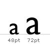
In the sixteenth century, European typographers developed a series of typeface sizes, a scale (the musical analogy is a good one - stick with me). As shown in the diagram they are sizes we’re are all familiar with. Six point through to Seventy-Two point type has remained pretty much intact for over four hundred years. In fact, they are the default font sizes in many applications (give or take a few.).

So, what’s so special about these sizes? Well, because this scale of sizes has been used for centuries, if set correctly, type set in this scale will appear more pleasing to the eye and therefore more legible.
An interesting point. Originally the sizes in the scale were referred to by name instead of by point size. here’s a few examples of some of the older names:
- 6pt: nonpareil
- 7pt: minion
- 8pt: brevier or small text
- 9pt: bourgeois or galliard
- 10pt: long primer or garamond
- 11pt: small pica or philosophy
- 12pt: pica
- 14pt: english or augustin
- 18pt: great primer
- 21pt: double small pica or double pica
- 24pt: double pica or two-line pica
- 36pt: double great primer or 2-line great primer
New software, and modern methods of typesetting, has allowed character heights which fall outside of, and within, this scale. this freedom has resulted in a typographic free for all, allowing designers to pick sizes which may not be related to one another as according to this scale. Is this a bad thing? I’d argue that it is.
Let’s go back to the music analogy. It’s like composing a discordant piece of music. Clashing notes, clashing type. but, if it’s clashing you’re after, that’s fine. If, however, you’re after harmony and melody that stands the hairs up on the back of your neck, stick to the notes in the scale folks!
Application of the scale
So let’s put some of this into practice. I’m going to be using this very website as an example.
I started off designing this website with something very specific in mind - typography. I wanted to make sure this site would work by a simple, clear hierarchy of typography set against a simple modular grid, with plenty of white space on which to ‘hang’ a number of design elements (in my portfolio for example).
Following the typographic scale described in the previous section, I set about applying this to the CSS based design.
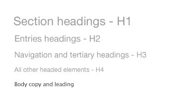
These are the elements for the typographic hierarchy. Note, I’m using pixels as my base measurement, not points. And yes I do know the pixel’s are different on different platforms.
The thing about type sizes in CSS is if you want to remain true to typographic tradition, you have to specify em’s or percentages based on an absolute unit of measurement, in this case a pixel. If you use the relative - small, x-small etc. - there aren’t enough declarations to complete the scale and the sizing of each increment is fixed at 1.5 going up the scale or 0.66% going down. (apparently this depends and was also changed to somewhere between 1.0 and 1.2 in CSS2.) But anyway, I don’t want to get fixated on the best CSS approach to this. This article is about typography.
These are the pixel sizes for my main headings:
- 11px /16.5px - Body copy and leading.
- 24px - Main heading used as section headings on the Homepage, Portfolio homepage and entries.
- 18px - Headings for journal entries and portfolio subheadings.
- 16px - All navigational and content tertiary headings.
- 13px - All other headed elements.
This would give me the following styles visually

These translate into the following way into CSS, using percentages for scaling purposes.
- 11px /1.5em - Body copy and leading.
- 218% - Main heading used as section headings on the Homepage, Portfolio homepage and entries.
- 164% - Headings for journal entries and portfolio subheadings.
- 145% - All navigational and content tertiary headings.
- 118% - All other headed elements.
So, within my CSS file, it looks like this:
body {
font: 11px/1.5em “Lucida Grande”;
}
h1, h2, h3, h4, h5, h6 {
font-family: helvetica, arial, verdana, sans-serif;
font-weight: normal;
}
h1 {
font-size: 218%;
}
h2 {
font-size: 164%;
}
h3 {
font-size: 145%;
}
h4 {
font-size: 118%;
}
Using these values for the size of the headings creates a natural relationship between them. The typography is harmonious as a result and it only took about five minutes to implement. Not long at all.
Size really does matter
It really does. If you take anything away from this series, please let it be this. Stop and think about your type sizes, just for five minutes. Plan them, don’t just choose whatever you feel like from the dropdown in Photoshop. Make sure they are ‘in tune’ and then apply the theory to whatever medium you are designing to.
Next up the series we follow on from this with weight.
The series
This is the fourth installment of this “Simple Steps…” series. Next up we have Typographic Hierarchy - weight
- Measure the measure
- Hanging punctuation
- Ligatures
- Typographic Hierarchy - size
- Typographic Hierarchy - weight
Tags that this post has been filed under.