A sneaky peek: Codex
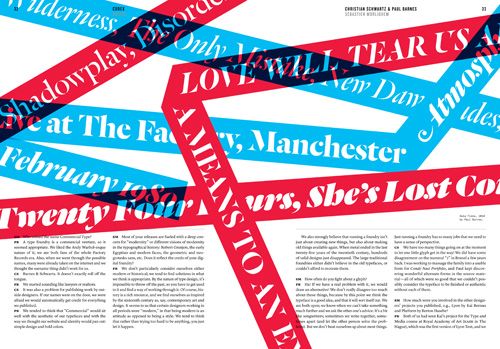
Over the past week or so, I've had the absolute pleasure of having a sneaky peek at an upcoming typography journal that promises to blow your mind. Created by typographic tour-de-force, John Boardley – of I Love Typography fame – and my good friend, Carolyn Wood (Editor-in-Chief), Codex is nothing short of incredible. Firstly, let me tell you this: it is stunning. Beautifully crafted; both in prose and design. This is more than a journal, it's a work of art.
In their own words:
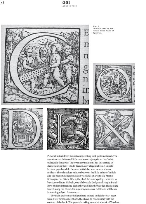
"Codex is a hybrid of magazine and journal. Beautifully designed, visually appealing, an immersive experience with a lively voice, it is also serious about its subject: authoritative, scholarly at times, but not dry in tone. It’s serious, but not stuffy. It loves the people, tools, and type associated with this craft, from the man carving beautiful cherubim into wood blocks in the 1400s to brilliantly formed modern interpretations and departures. It embraces the web and is watchful for the future’s classics."
As a member of the International Society of Typographic Designers, I receive their journal on an annual basis. The content is engaging, deeply respectful of the craft, its roots and future direction. If there's one criticism I have, is that the journal has yet to provide me with any worthwhile content about typography on the web. Typography is a craft that permeates so many design disciplines, and there needs to be a regularly published journal that covers that breadth. Codex promises to do that, and so much more. I for one can't wait.
The website opens tomorrow for pre-orders. Do yourself a favour, order one.
Tags that this post has been filed under.

