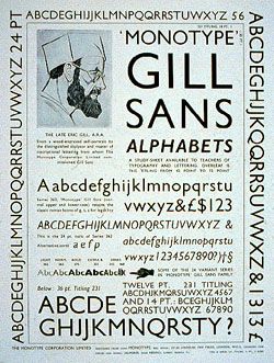
Typeface of the month: Gill Sans

Well, Gill Sans - as well as Helvetica - are perhaps the two typefaces I use the most. I have a love / hate relationship with them both, or rather with particular weights of both, but they are two typefaces which continue to surprise me with their beauty and versatility.
As we’re all probably aware Gill Sans is a pretty standard font these days, used and abused as a result of being part of a default font installation on certain operating systems. Like Times New Roman, a lot of people have become tired of its expressive curves (yes, that’s right, I did say ‘expressive’). I’m hoping after reading this, at the very least, you’ll look upon Gill Sans with fresh eyes.
A bit of history

Due to it’s legibility and its ‘Britishness’, Gill Sans has been adopted by many companies and organisations as their corporate typeface. Notable mentions are:
- BBC
- Royal Society of Arts
- The Church of England
- Network Rail
Not to mention the number of companies who have had typefaces designed which have been heavily influenced by Gill Sans.
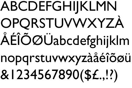
The typeface itself and that horrible ‘a’
Gill Sans is a beautifully designed typeface which, unfortunately, has suffered at the hands of software, and to a certain extent, its own popularity.


If there’s one thing about Gill Sans that puts me off is the lower case ‘a’. Just look at it. Top heavy, unbalanced and well, just weird looking.
Live with Gill Sans for one year
Early on in my college days, when I knew nowt, one of my typography lecturers was having a bit of a rant about typefaces. His main gripe was that with so many fonts at our disposal, designers and especially students, are like kids in a candy store and generally, he said, it was to the detriment to the design.
‘Learn to live with a typeface for one or two years, try to use nothing else but that face’. You can imagine the looks on our faces. However, due to corporate branding guidelines for the past three years I’ve been in that position in my day job. It was pretty tough to begin with, coming from a commerical company who specialised in branding with a ‘new brand, different typeface this time’ approach. Now, however, I sometimes struggle to use different typefaces when faces like Gill Sans and Helvetica answer the design problems so elegantly.
To wrap up. Classic typeface - overused and misunderstood - but next time you need to design a form, signage, or need to communicate something which is quintasentially British, then spare a thought for Gill Sans. 7 out of 10. (it would be 8, but that ‘a’…)
Tags that this post has been filed under.