The Business of Responsive Design
Responsive design affects a lot more than just our website’s layout. From content, and how it’s created, to the structure of teams and organisations can all be affected by the processes responsive web design brings.
This post is a rough transcript from my talk at Handheld Conference last week in Cardiff on just that.
I’ve a confession to make. I’m an armchair mountaineer. I’m too much of a coward to actually put myself in the type of risk mountaineers do, but for the last decade or so, I’ve been reading as many mountaineering books as I could get my hands on. And I’d like to start by telling you a famous story of Alpine mountaineering.
The Eiger Nordwand in the Bernese Alps in Switzerland. An 6000 ft, vertical, concave face perpetually shrouded from the sun. Facing North, the Eiger's north face has been the scene of some of the Alp's greatest mountaineering victories, as well as perilous catastrophies.
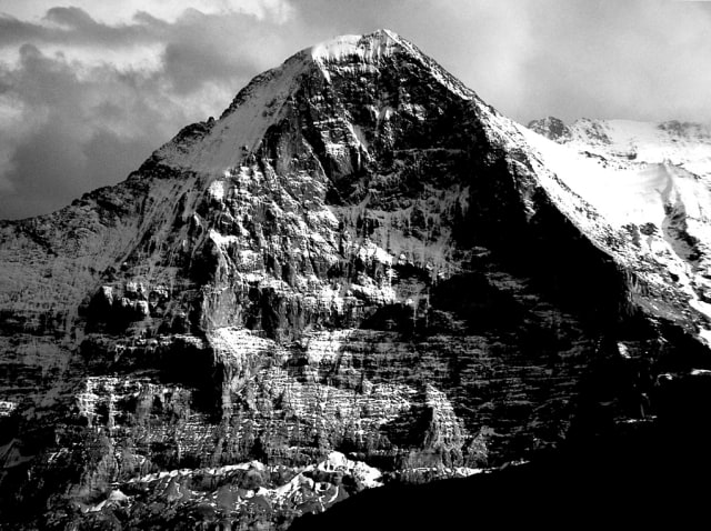
This is the North Face of the Eiger in the Bernese Alps in Switzerland. The Eiger (meaning: Ogre) is a staggeringly difficult face to climb. Nearly two vertical miles high of ice-coated loose rock. It’s a treacherous place. It’s also the place I proposed to my wife in 2003. But that’s another story. The story I’m going to tell you starts in 1936.
Andreas Hinterstoisser, a talented German climber, in the meadows below the Eiger enjoying the sunshine.
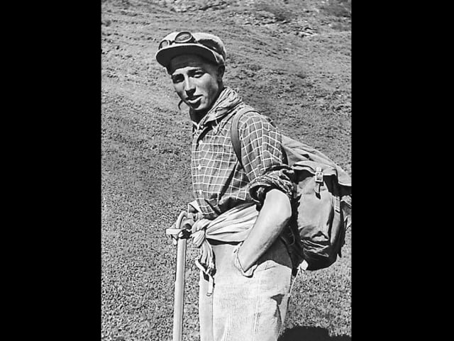
In the winter of 1936, Andreas Hinterstoisser (pictured), Toni Kurtz, Willy Angerer and Edi Rainer set about tackling the face of the Eiger – then unclimbed. They’d established the rough route, and after a day had reached an impassable, sheer area of rock just underneath the Rote Flüh – a prominent feature on the face.
Let’s leave that story there for now and come back to it later.
Let’s talk about responsive design.
Responsive design has changed my work and, ultimately, how I do business. This talk is about how it’s done that. But before I do that, I’d like to tap about the definition of responsive design.
If you talk to some people, responsive design is just fluid grids and media queries. To other people, it’s that your website fits on a tablet or mobile phone and changes to adopt. To others, it’s the way to save money by consolidating teams. Responsive design – like AJAX, or Web 2.0 – has become a buzz-word to represent a change. A change in our industry. A change in the way people are consuming content. That’s the type of responsive design I’m going to talk about.
I’m going to talk about three specific areas of how it has challenged the way we work at Mark Boulton Design.
1. Structured content
It’s strange to think that there was a time on the web where content was a second-class citizen. As a student of editorial design, I’ve always found this odd. In the past, whenever I heard ‘content is king’, my response was generally ‘er, yes’.
Responsive design has challenged how we commission, create, edit and design for content. I’d like to talk a little bit about how this has affected two clients of ours. Firstly, our work with CERN.
Different content for different people, at different times, on different devices.
I’ve talked about CERN before at conferences, but not really in this amount of detail. When we started working with CERN a few years ago, the whole project was framed in one sentence by the head of the CERN web team…
We have a content problem.
And they did. They didn’t really know who their audiences were, how to talk to them, or what they wanted. Following months of research, it became clear the audience for the CERN site was comprised of students, scientists, the general public and CERN staff. Interestingly, all of those four large groups had a common need: updates. They wanted to know what was going on. But here is the problem: each group of people needs to hear the same update in different ways. Let’s take an imaginary use-case of an announcement for a new particle that’s been discovered.
For the general public, they are generally learning a lot about CERN from elsewhere. Not on the CERN site. So, they are coming to the site from another trigger – either another website, or the TV, or a magazine or newspaper – and their overall comprehension of the work done at CERN is minimal. The update needs to be worded to accommodate that. But that update also needs to appeal to scientists working in high energy physics and associated fields. They want the detail, in the language that suits them. Already, our one update is fragmented. Throw in students and educators, then our update is going to have to work very hard if it’s just one piece of content.
Therefore in the CERN redesign process, the editorial structure of updates needs to be fragmented and structured in such a way to accommodate different words for different audiences. A responsive design challenge that has nothing to do with how something looks, but how it is structured and how it works in the CMS.
This brings me onto my second point on structured content.
Fractured content
We’ve also been working with Al Jazeera for a few years on redesigning their digital platform. Throughout that process, in just that short space of time, we’ve seen the rise of responsive design and how it affects how content is created and viewed. One example of this is just the process of how news works.
We often think of a news story as a page. A useful, familiar construct. It has a headline, a stand first, some paragraphs and maybe an image or a map. But after studying how their editors work, it became clear that this is not what a news story is. News is always moving.

A story starts as a seed. Something that comes down the wire…
There has been an earthquake in Japan.
Nothing more. Not yet.
Content starts as a seed. Something small. Then grows over time to pull in various content types.
Then, over time, the story grows and, like a snowball rolling down a mountain slope, more content starts getting attracted to it – maybe a tweet, other articles, images, video, timelines, quotes etc.
Because a news story is not a page. A story is the link between bits of content. The question here is how do we – meaning editors and designers – curate and cajole this content to most effectively tell the story?
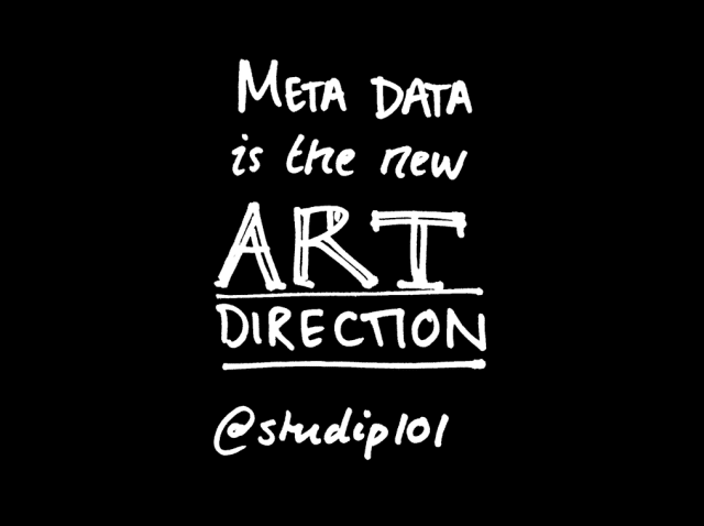
The answer does not lie only in design. The answer lies in how content is structured and categorised. Meta-data is the new Art Direction.
2. Process
Responsive design has been perhaps most visible in its ongoing challenges to process. How we do what we do is coming under increasing pressure, and here are several ways in which I’ve noticed how.
Proximity
I started out working in advertising. As a student, I was an intern for a couple of years at an agency in Manchester. Other than the work, one of the things that has become clear now I run my own design business.
When advertising agencies talk about work, they talk about it in terms of accounts, not projects. When you win work, you win an account – for a period of time. An account is commitment over a period of time.
We will work with you on all our projects for 12 months.
This means a client will invest in you, and the time it takes you to learn their business, familiarise yourself with the challenges and give you the space (and budget) to do great work.
Projects are not a commitment. Projects are relatively risk-free.
You will deliver this website for this much money in this time-frame.
Approaching work this way leaves little room for any ongoing commitment, from client or agency. It’s like a first (and only) date. And with that comes a distance.
Over the past couple of years, I’ve seen my peers move from agencies and studies move to products and client-side. In doing so, they are closer to the problems. With the space to move in an agile way without the constraints of any binding commercial relationship. This reminds me of a story from Kevin Spacey about his work on the House of Cards
Kevin Spacey recently gave a rousing talk at The Telegraph in which he talked about how TV commissioning works in the US. He went to all the networks in the US to pitch the show. They were all interested, but each one wanted to do a pilot. A pilot which, in 45 minutes, would establish the major plot-lines, introduce the characters, the love-triangle, the cliff hanger.
Kevin Spacey delivers one of the best talks I've ever seen (oh, to be an actor with this sort of delivery!) about why and how the House of Cards was commissioned on Netflix.
“It wasn’t through arrogance that we weren’t interested, but we wanted to tell a story that took a long time to tell. We were creating a sophisticated, multi-layered story with complex character that would reveal themselves over time and relationships that would need space to play out.”
The House of Cards was about the long game.
To me, many web projects can feel like a pilot. Relatively low risk, low on commitment to work together without the time and space for the problems to play out. Proximity to the problem – a hand forced by responsive web design’s challenges – comes from working closely, over a long period of time. An account, not a project. A season, not a pilot.
The project rope-a-dope
In 1974, Muhammad Ali and George Foreman fought in the ‘Rumble in the Jungle’ in Africa. Forman was the favourite having beaten Ali three years before. he was strong. Young. And a great boxer. He was sure to win.
Muhammad Ali vs George Foreman in the 'Rumble in the Jungle' in 1974.
Throughout the fight, Ali let himself get hit on the ropes. To give the impression he was tired, lose, and close to defeat. All the while, he was whispering in Foreman’s ear ‘You’ve got nothin’‘… ‘nothin’’. Forman blew himself up trying to knock Ali out. In the dying moments of the fight, Ali knocked Forman out and won the fight. This technique was coined the ‘rope-a-dope’.
Just going back to my last point for a moment. One of the results from being closer to the problem is that you have more exposure to the mess of design. Making things is messy. And to some people – especially clients, who can expect nice shiny things handed to them – may not be expecting to be exposed to that.
Sometimes they will freak out. And it’s our job to sit back on the ropes and take it on the chin. But, instead of goading them, we should offer words of reassurance. We should shift our process to something that may feel more comfortable. You have to break a few eggs to make an omelette, after all.
Where is the design?
Getting in the browser sooner. Looking at content sooner. Iterate. All of these things have a knock-on to design and how it’s received by a client.
The Fidelity Curve. As a project time-scale increases, so does the fidelity of the design work being done.
For a few years now, I’ve talked about the fidelity curve. A simple graph to explain to clients that over time, we increase the fidelity of a prototype and slowly layer on the visuals. This is so we can fail quickly on low-risk, low-fidelity work. Mostly this is good and works well, but recently, I had an interesting discussion with a client in which they asked where the design was.
It’s an interesting question, because in this process, the design is everywhere. And unless you take the client along every step of the way – knee deep in the mess of design, being closer to the problem – then how do you manage the expectation that, at some point, a client will expect a presentation, or a reveal’ of how the product will look.
3. The Trend
“I want a responsive…”
As I said, responsive design is a trend. Or, rather, an awakening. As such, a lot of organisations and businesses are behind the curve . But one thing many people aren’t asking (and, I know this because I ask) is ‘is it worth it?’ or ‘Do you really?’
In 2011, our first responsive site was a site for World Skills London. It was a fun project, geared around a single event in London in which 200,000 visitors would attend and watch the various activities in the competition. As part of this project, we designed a responsive map. A cool diagram with a responsive image map that would scale and allow users to get from A-Z in the event by using their phone. Cool.
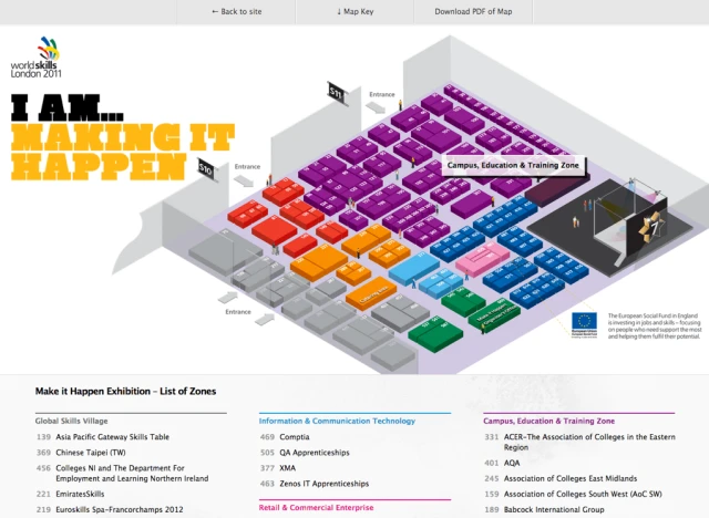
Except, during the project retrospective, it became clear that, actually, only 25 people used it. It was not needed.
Back to Hinterstoisser
Let’s go back to the Eiger and Hinterstoisser and three other men trying to climb the North Face. If you recall, after a day or so, they had arrived at a seemingly impassable face of rock under the Rote Flüh. After much deliberation about trying to re-route, Hinterstoisser decided to have a go at traversing the feature. And he succeeded, and with that, opened the gateway to the rest of the face and rest of their climb.
The Hinterstoisser Traverse on the North Face of the Eiger is a 150ft pitch of vertical, and often ice-glazed, rock. Now, with a fixed rope in place, the traverse was undertaken by Hinterstoisser by tensioning a rope high above him and traversing downwards and across.
Today, the same traverse is still used across the same slab of rock.
Last week, I did a survey on Twitter about the business of responsive design. After 500 or so responses, it’s clear that everyone is finding everything hard right now. The change is so big, and so rapid, that we’re struggling to keep our heads above water. And this especially goes for those working in-house or clients.
Breaking new ground is always difficult.
But, just like Hinterstoisser, take heart in knowing that what we’re working on right now is a legacy for designers and developers in the months and years ahead.
Tags that this post has been filed under.