Some thoughts about signs

Signage does a number of things - it helps us get to where we want to go, it informs us, warns us and the list goes on. Let’s deal with the first one… (or if you’re not bothered, skip straight to the confab)
From A to B
Getting to where we want to be. It’s a big deal, and signage helps us do that. The professional service dedicated to just this is called Wayfinding, and it does just that, helps us find our way. Wayfinding signage is found in almost every city, building and civilised environment on the globe, from official road signs to hand painted ‘toilet’ signs in local cafe’s.
Having been involved in a couple of wayfinding projects I found the research and development fascinating. It usually involved developing a signage system, mocking it up in black and white prints and building wooden stands, then positioning them in a space and watching how people follow them. As they were temporary we could audit the people flow and make the required changes so that people could find what they want.
Designing a signage system is a little like trying to guess what people want to do in a space. For public buildings, like libraries and museums, they have to inform in addition to pointing people in the right direction. Museums are particularly interesting and, you’ve guessed where I’m heading with this, the similarities between museum signage and web site architecture are plenty.
Where’s the f**king toilet
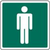
When somebody enteres a building, especially if they’ve had a long journey or they had too much orange juice in the morning, they will want to know one thing - ‘where is the toilet’, they will be single minded in that task as well. They will look for one of two things, a sign with the word, or if it’s in another language an icon of a man or a woman. That’s it. They shouldn’t have to learn a new signage system, or try and work out a designer’s ‘creative’ impression of what a toilet sign should be.
My point is this. Universal signage systems have been developed to overcome language so that manufacturers don’t have to produce several products for different markets. This system works well until somebody does it differently and your daughter pees her pants because you couldn’t find the toilets because they client wanted to be ‘different’!
The same goes for web sites.
Provide clear signage
A user will come to a web site with a specific task in mind. Not going to the toilet, but more like they want to complain about something or they need to buy their daughter some new pants.
I may be preaching to the converted but putting the user first, understanding their goals and designing to them is the best way to deliver on the sites goals.
I know I’m opening up a big can of worms here with possible discussion about iconography, semiotics, usability, Information architecture, UCD etc. But understanding how signage works can go a long way to understanding how people navigate on a web site.
I’ve been doing a little reading on the subject and it’s a bit like opening Pandora’s Box. There is a lot out there, specifically on semiotics, but dipping into linguistics and psychology. It’s quite difficult to filter some of the information and make it useful for you in a practical sense and you can’t read everything right?
So, here’s what I’ve found out so far…
Let’s start with Semiotics
Semiotics is the study of signs and symbols and their use or interpretation. There are three main areas:
- The signs themselves
- The way they are organised into systems
- The context in which they appear
Extracting meaning from the signs is then possible once we understand the structure of the signs. They can be categorised like this:
Icon
This resembles the sign. A photograph, a diagram, even a sound like ‘bang’.
Index
This represents a link between the sign and it’s meaning. Smoke and fire for example, traffic light colours.
Symbol
These signs have no logical meaning between the sign. An example of this would be where a symbol has become linked with an organisation or product, the red cross for example. Symbols are commonly used for logotypes.
How is this useful in designing for the web? Well, extremely and not just web design either but designing for any medium.
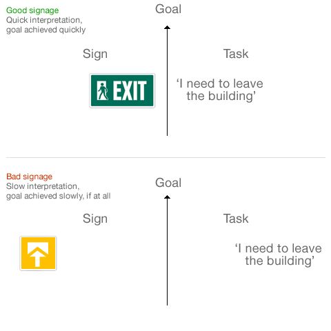
A person has to establish meaning from a sign or symbol. They then use this meaning to do many things, one of which could be to accomplish a task. The closer the design of the sign is to the task, the quicker meaning is understood and the task is completed.

There is of course the Usability / Aesthetic effect to take into account too. With this in mind applying it to web site design is actually quite straight forward.
A few things to consider
- When designing icons for web sites or applications draw on real world signage standards if you can. If you can’t, try drawing on metaphor. Arbitrary shapes for icons will not work.
- When thinking about labels for your navigation, think clearly. Simple words for content will go a long way in shortening the gap between sign and task completion.
- Use colour carefully. Point users in the right direction with high contrast signs, or buttons. Just as you may speed down the road at 70 mile an hour and read a sign in less than 2 seconds, a user speeds through a website and may not give you more than two seconds. Be conspicious with your signs.
- Be consistent with your signage. Be it words or icons, be consistent in design and tone of voice. Let your users know what to expect.
There’s just a few things I’ve picked up over the past few years. Once I get some more stuff worked out, I’ll let you know. In the meantime I thought it may be fun to have a bit of a signage confab.
How about a signage confab?
Every designer likes icons or signs right? What’s your favourite? This could be a photograph of one, one you’ve designed, sky’s the limit. Usual confab stuff applies:
- Host the image on your server and link it in here.
- Simple HTML is fine.
- Keep it below 400px wide please or you’ll bust me layout.
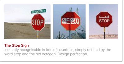
Oh, and here’s mine…

Tags that this post has been filed under.