Incremental leading
There has been a lot said recently about Vertical Rhythm. Richard Rutter began the work on 24ways last year with the piece ‘Compose to a Vertical Rhythm’. This was built upon by Wilson Minor on A List Apart recently with his article on Baseline Grids. All sound typographic advice. If you haven’t read both of them, I’d urge you to do so now otherwise you know what I’m on about it in this post.
At @media this year, I presented ‘Five Simple Steps to Better Typography’. Step two in my presentation was was Vertical Rhythm where I reiterated some of the excellent points Richard made in his article and also the presentation we both gave in at SXSW in March. I also added something of my own: Incremental leading, or Incremental line-height.
Too much leading in the sidenote
Working through both Richard’s and Wilson’s articles, they both treat the sidenote in the same way. They align it directly to the vertical rhythm unit. This is correct of course. But, to my eye, the line-height in those sidenotes, as it’s a smaller type-size, is too large. 10px on 18px leading is stretching it. So, how do we reduce that line-height whilst still adhering to the vertical rhythm we’ve established. Once again, we look to print design for that answer.
In editorial design, there is a technique used for sidenotes and boxouts that aligns to the baseline grid, or vertical rhythm. It’s called incremental leading.
Incremental leading
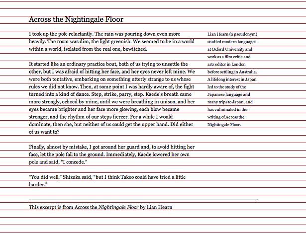
Here we have a simple page of text based upon Richard’s example. There is an H1, some text, a sidenote and a footer. They all align to an 18px vertical rhythm shown in red.

A simple document set to an 18px vertical rhythm
To my eyes, there is too much line-height to the sidenote. So, how can we reduce this line-height, but adhere to the 18px rhythm?
Instead of aligning every line in the sidenote with the vertical rhythm, when you use incremental leading, you align, say, one in every four or one in every five.
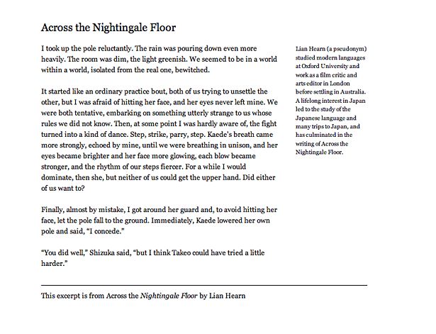
Here’s an example with incremental leading set to align every fifth line of the sidenote to every fourth line in the main content.

Sidenote set to vertical rhythm using an incremental ratio of 5:4
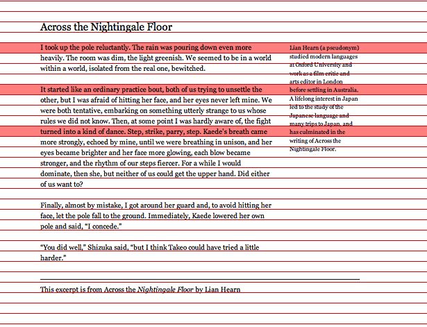
Adding in the vertical rhythm grid once more we can see the line alignment.

Here you can see the ratio of 5:4 incremental leading
But how do I do this in CSS?
Firsty, make sure you read Richard’s article and apply the rules to body of text. Once you’ve got the 18px rhythm set up and everything’s aligning as it should, then you can look at the sidenote.
As we’ve decided we want to align 4 rows of the main content to 5 rows of the sidenote, we begin by finding the value, in pixels, of 4 rows combined.
Four lines of the main content.
18px x 4 = 72px
Then we find the value for 5 lines of the sidenote.
72px ÷ 5 = 14.4px
To calculate what 14.4px is in ems (in relation to the body, and the type size for the sidenote)
14.4px ÷ 10px = 1.44em
We then add the values to the CSS for the sidenote.
.sidenote { text-indent:-0.7em; width:12em; margin-right:0; margin-top: 0.28em; font-size:0.8333em; line-height:1.44em; position:absolute; top:0; left:42.6em; }
You can see this working in this example.
However, note the top margin. I really had to fiddle around with this manually to make sure the alignment was correct. I did try and work out the maths for it, but it proved to be very difficult as really I needed to find the cap-height value of the typeface in order to provide a margin.
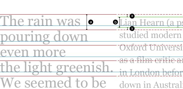
Martyn, a bloke I now share an office with (who is also a Mathematics graduate), provided me with this diagram to illustrate my problems.

Diagram showing relationship between baselines, vertical rhythm and how line-height is applied in CSS
As you can see, the problem is I needed to find the value of ‘x’. In order to do that, I’d need to know the value of ‘b’. The difficulty arises from trying to align the baselines and the only way of doing it was aligning it by eye. But, if you can fathom it out, then I’d be grateful.
Now, all I need to do is find the time to apply to this site and the new business site.
Tags that this post has been filed under.