Five simple steps to better typography - Part 2
Hanging punctuation is an area of typographic design which has suffered at the hands of certain software products. It’s a term which refers to glyph positioning to create the illusion of a uniform edge of text.
It’s most commonly used for pull-quotes, but I feel the most neglected is that of bulleted lists.
With the advent of desktop publishing it became suddenly very easy and cost-effective to produce bodies of text. The problem was these bodies of text work within a box. Every character in this box had to be within the box, Hanging Punctuation requires characters to be out of the box. This was a problem for the software and as a result was ignored. An important aspect of typesetting just swept under the carpet like that. It’s a great shame.
Things are now getting better with Adobe Indesign offering support for Hanging Punctuation, I think the latest version of Quark may do it as well. Not sure about Word - probably not.
Well enough of the talk, let’s get down to some examples.
Examples of Hanging Punctuation
Lists
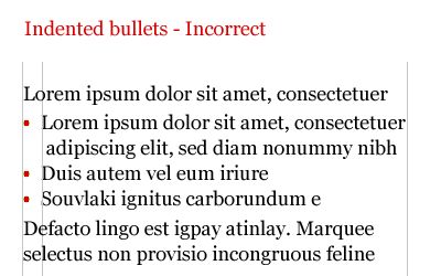
Without Hanging bullets

A ranged left body of type is pretty much destroyed, aesthetically, when punctuation isn’t hung. The eye looks for straight lines everywhere, when type is indented in this way, it destroys the flow of text.
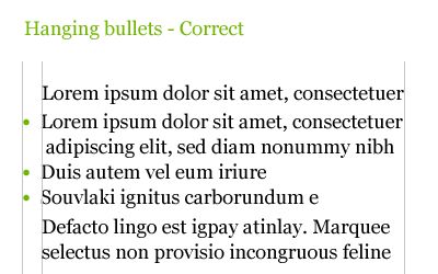
With Hanging bullets

With hanging punctuation the flow of text on the left hand side is uninterrupted. The bullets, glyphs or numbers sit in the gutter to highlight the list. This representation of a list is more sophisticated visually and more legible.
Pull-quotes
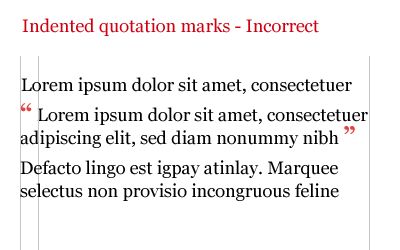
Without Hanging Punctuation

Nothing is more irritating than badly typeset quotes. The interruption to flow is considerable and the overall effect is pretty unsightly
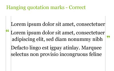
With Hanging Punctuation

Quotation marks should be ‘hung’ - See diagram below. In this example the quotation marks are hung either side of the quote. Once again this allows uninterrupted reading for the audience.
Hang it!
So, in short. Hang lists and hang quotation marks, when using pull quotes and quotes within a body of text.
And before you say “Mark, you don’t hang your lists on this site”, I will be, soon. The comments list is hung, I just need time to hang the bulleted lists… I get to it ok?
The series
This is the second installment of this “Simple Steps…” series. Next up we have Ligatures
- Measure the measure
- Hanging punctuation
- Ligatures
- Typographic Hierarchy - size
- Typographic Hierarchy - weight
Tags that this post has been filed under.