Vogue
The iconic Vogue magazine is like no other. A powerhouse of trend-setting design and editorial, it was, like many before it, striving to position itself to new digital audiences.
The Vogue team needed to move fast.
I was asked to join a small, multi-disciplinary team in London for four weeks to work on a rapid pilot to redesign Vogue.de. The resultant system would drive the redevelop of Vogue properties throughout the portfolio.

The priority for this pilot was to produce consistent, scalable foundations. To make decisions on the basics like colour, typography, iconography. To get real-world feedback with daily user research.
We didn’t have the time to reinvent the wheel, but we had just the right amount of time to make sure what we did was appropriate and scalable.
Pragmatism was the order of the day.


Systems thinking
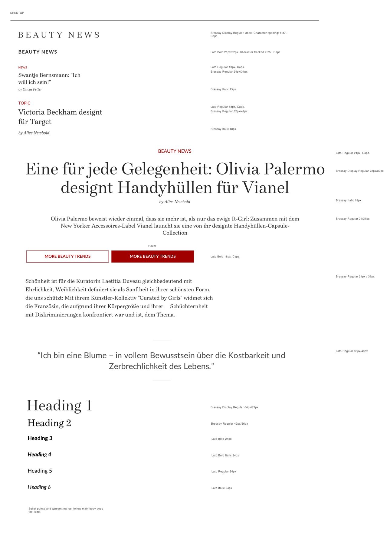
For a typographic designer the challenge with this system was the priority was images, not words. The interface was all about imagery and ensuring they are legible, inspiring and navigable. The words played a supporting role, in the same way the typography plays a supporting role to the content.
The typography considerations were undertaken with an empathy to the strategic goals of the interface whilst being mindful of the visually mature stakeholder audience within Condé Nast. We really sweated the details.
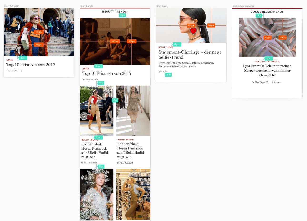
The components from the system were painstakingly produced in Sketch and available for the developers in the team. The UX designers also took these components to produce high fidelity mockups and wireframes for testing purposes.