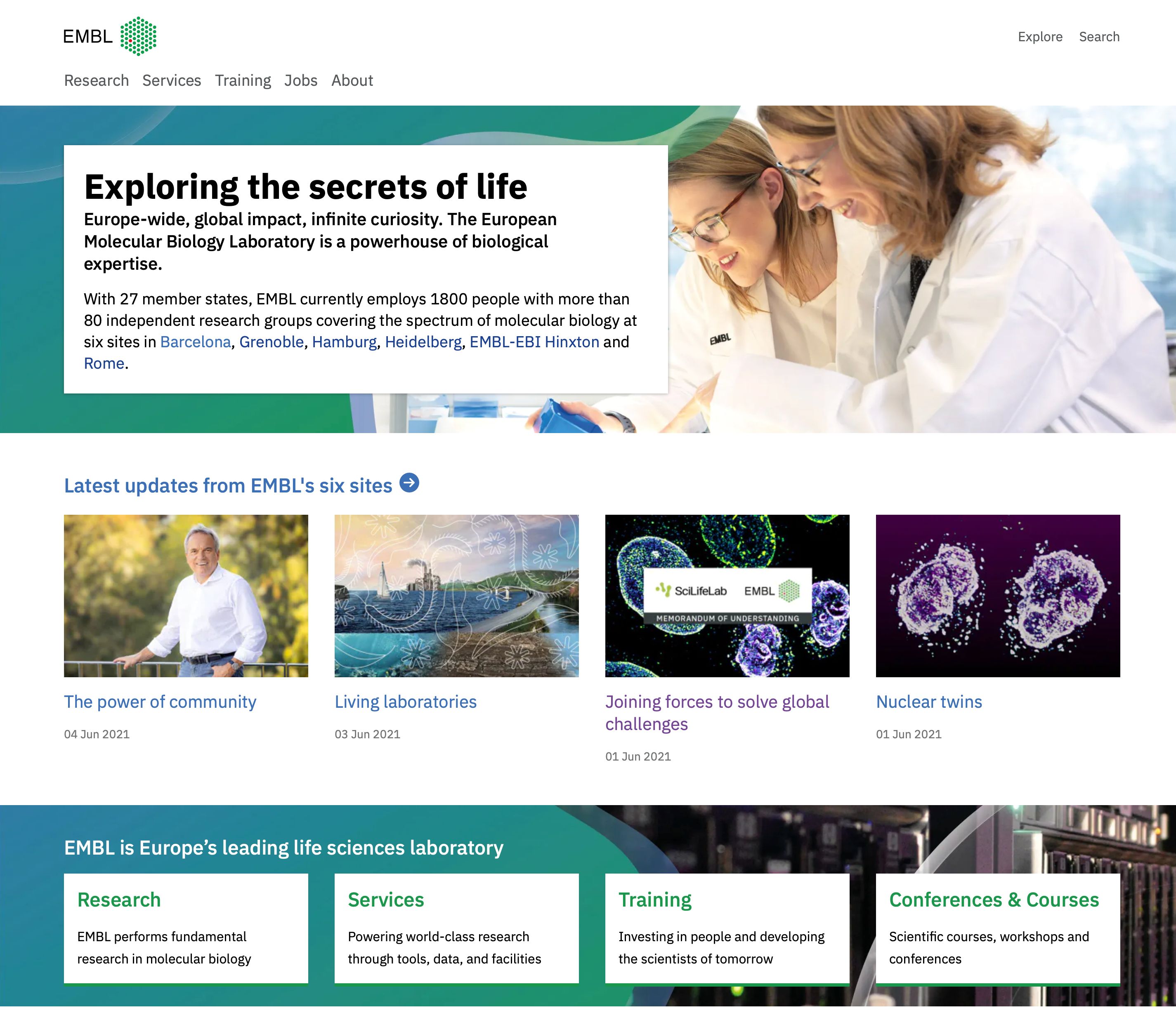
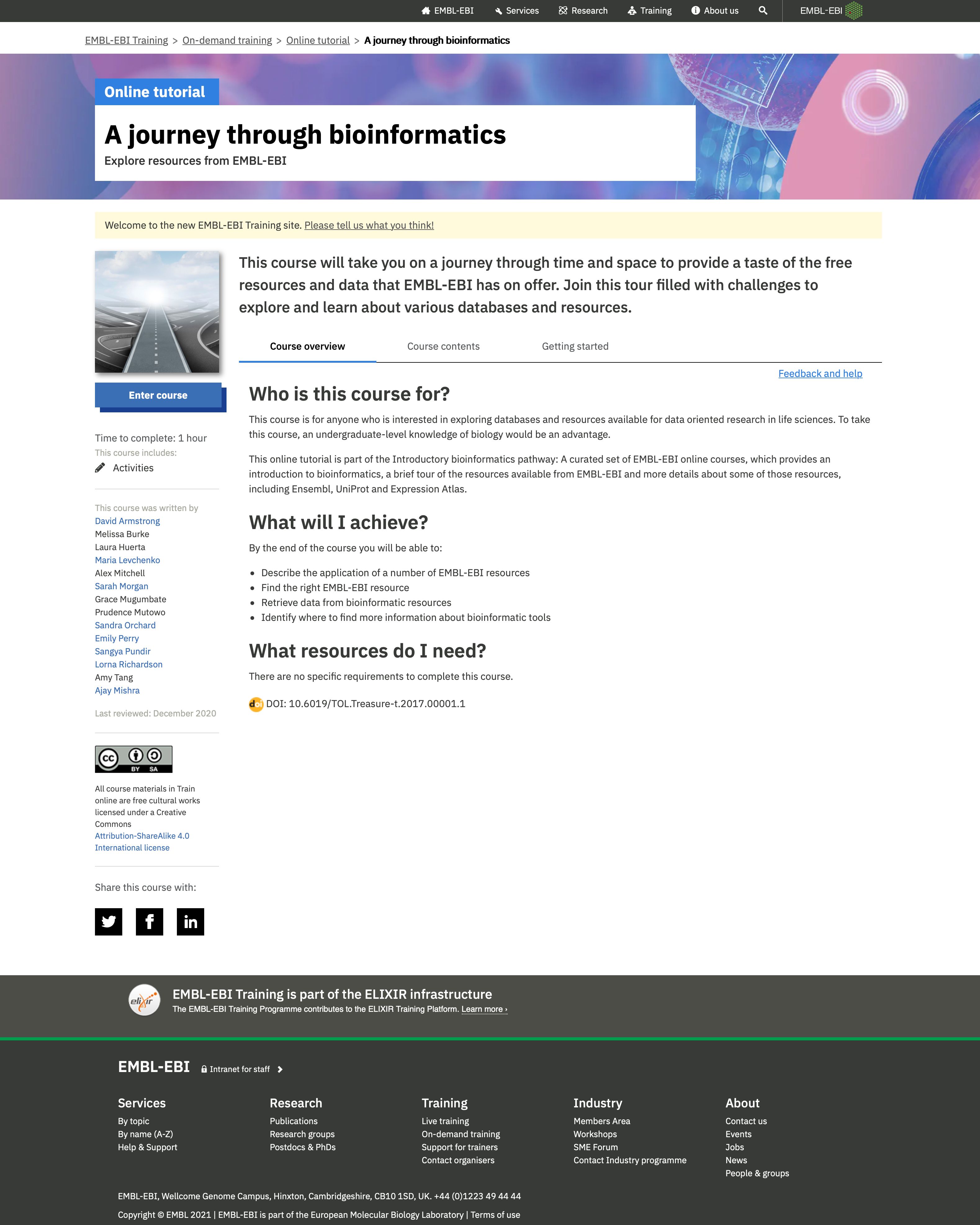
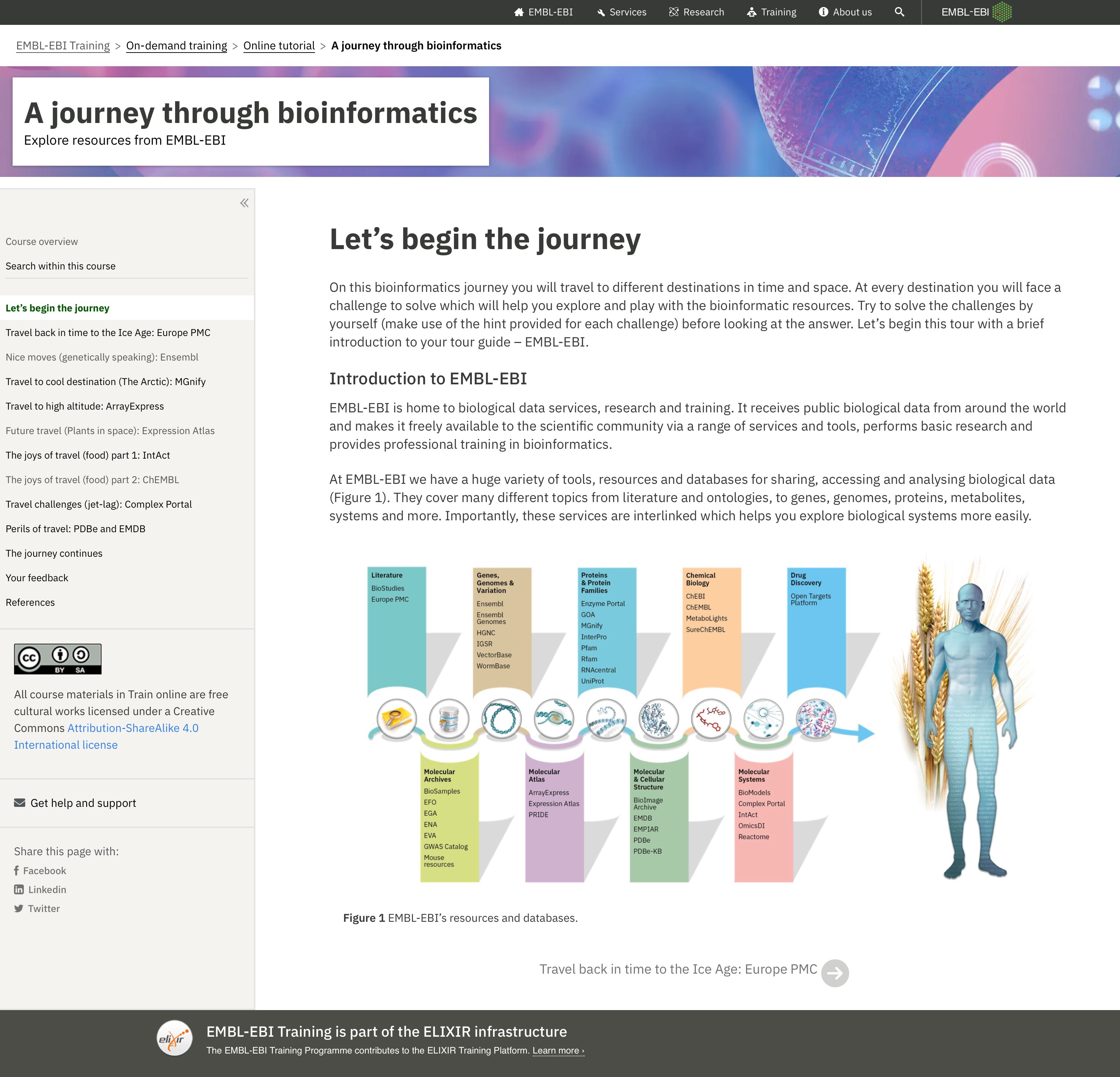
European Molecular Biology Laboratory
The European Molecular Biology Laboratory (EMBL) is one of the world's leading life sciences organisations. Located at six sites across Europe, EMBL is home to several thousand researchers working in fields such as Genomics and Bioinformatics.
I led Digital Communications at EMBL with the remit of delivering the digital components of a broader comms strategy, scaling in-house delivery capacity, and building the means to do so with a new design system, publishing platform, and delivery network across the organisation.
Digital Strategy
The new communications strategy at EMBL was split across several strands focussing on elevating the work being done, building the reputation of the organisation all through a reorganised cross-disciplinary team of over 30 editors, journalists, developers and designers.
The digital strategy was based on one central ideal: to build and scale sustainable delivery capacity in-house. Like many organisations, EMBL was in a redesign cycle with an external agency. The organisation struggled to iterate on its many web properties and did not have the internal expertise to do so. I started by building a small core product team to begin the foundational work of defining how delivery will happen.
EMBL Brand
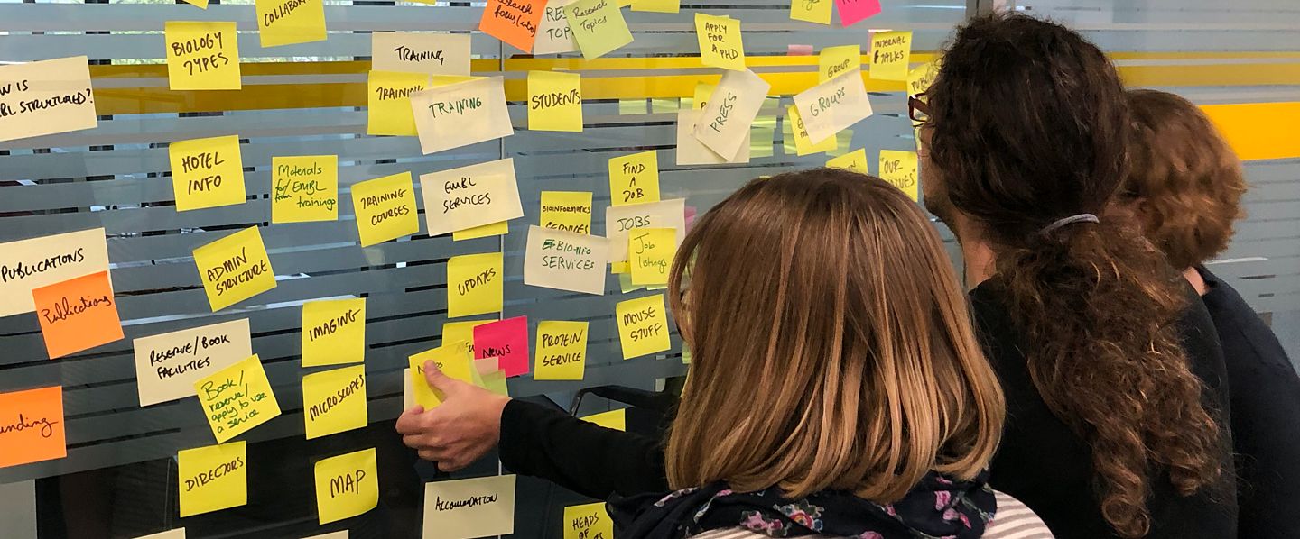
With such a diverse portfolio of products and services, users and stakeholders, it was important that any design system we developed was not a one-size-fits-all solution; it needed to adapt to its environment. We started by understanding and modelling the landscape. This comes from two places: research and content. By thoroughly auditing all content and services across EMBL, it gave us a clear of idea of the map. By speaking with users, we could understand the pain points, or even those places where users had gone through the pain and – whilst we might see a personal need to redesign a service – it was not in user’s best interests at all.
Modelling these outputs, we created a brand canvas – a tool we developed to help us make decisions. A quadrant diagram showing the audience types and their proximity to EMBL, against the level of brand 'volume'. In the initial scrappy sketches above, you can see where we've pressure tested these as a tool by mapping not just single entities such as brands, or services, but user journeys. We could see that as a user starts a relationship with EMBL, it changes over the course of a single user journey, but also over time – sometimes years
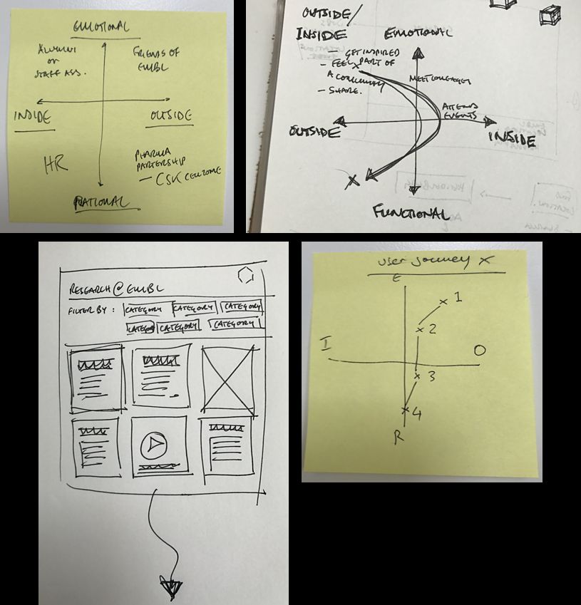
This work, whilst time-consuming and ardious, gave us a solid brief with which to design the system. We were not about to embark on a system of this scale and ambition without our guiding principles. One of which was now:
The system has to adapt to the user, product, or service. The EMBL brand volume – be it tone of voice, design, illustration, layout, sound, or all of those – has to be able to be dialed up or down accordingly.
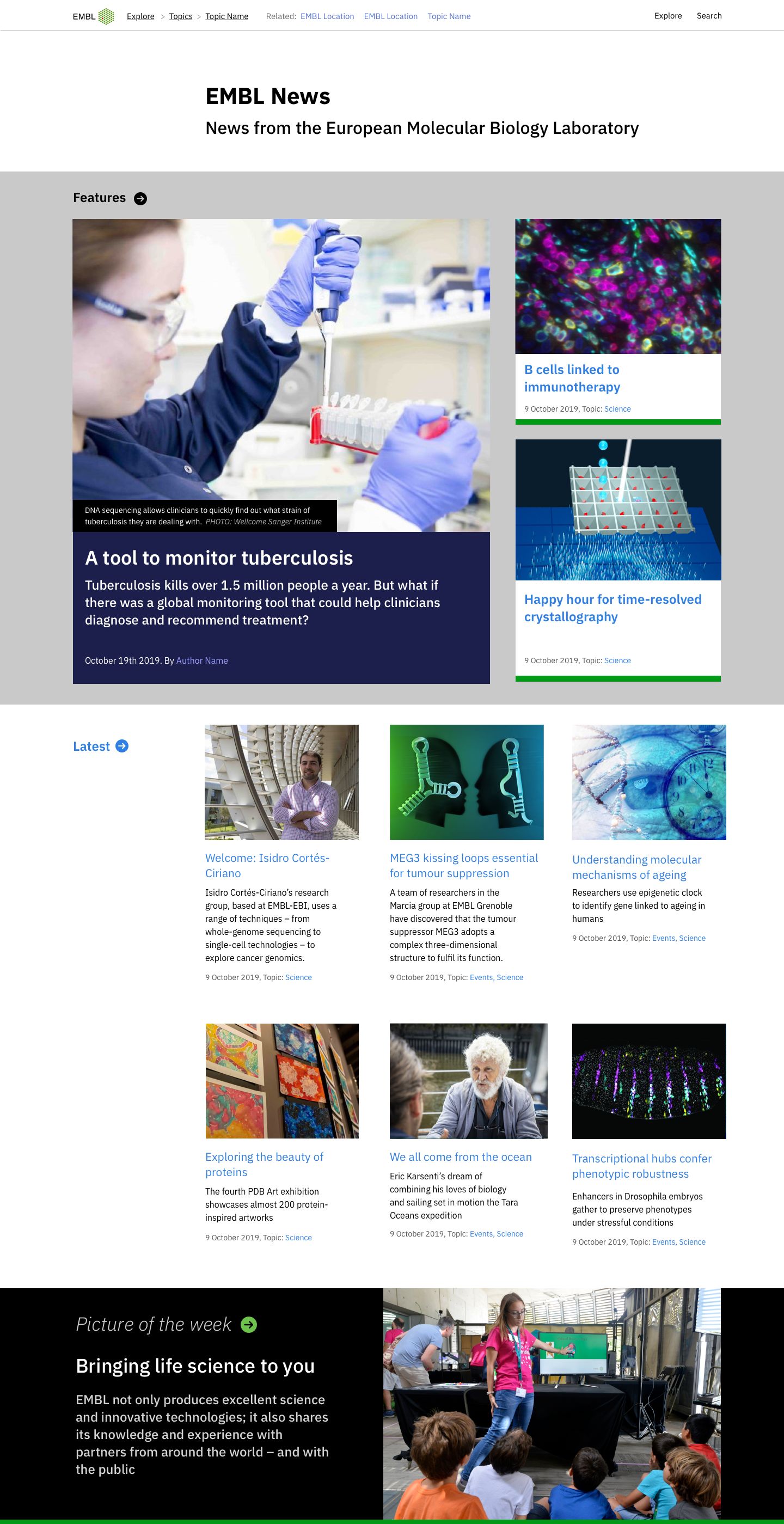
Design concepts
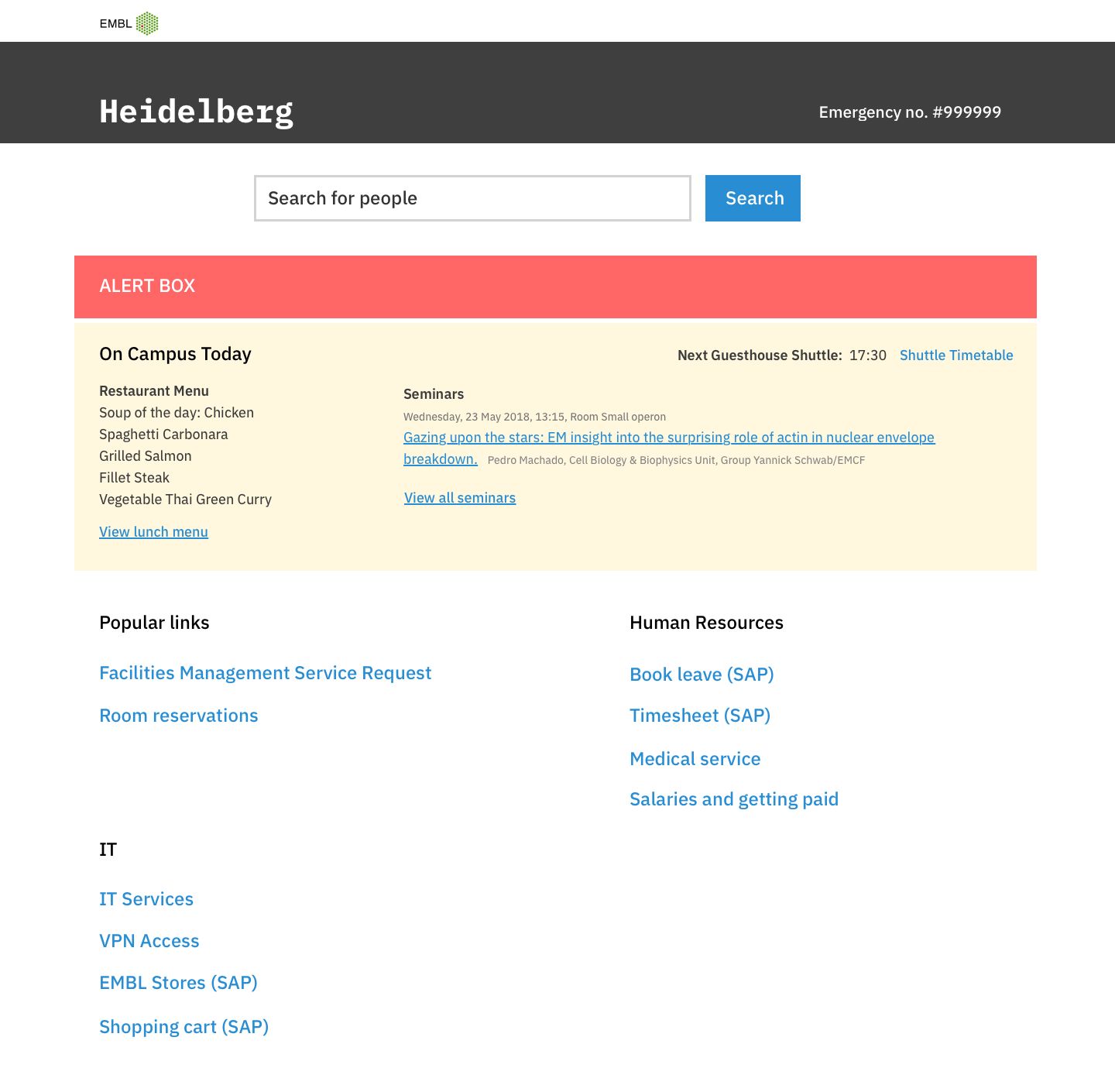
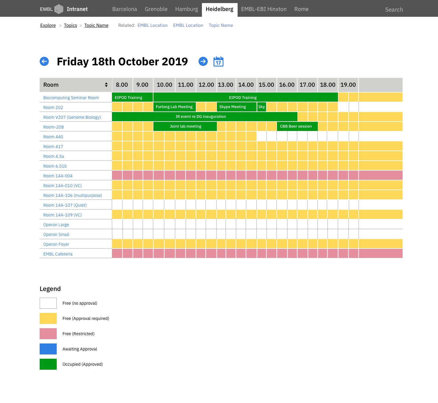
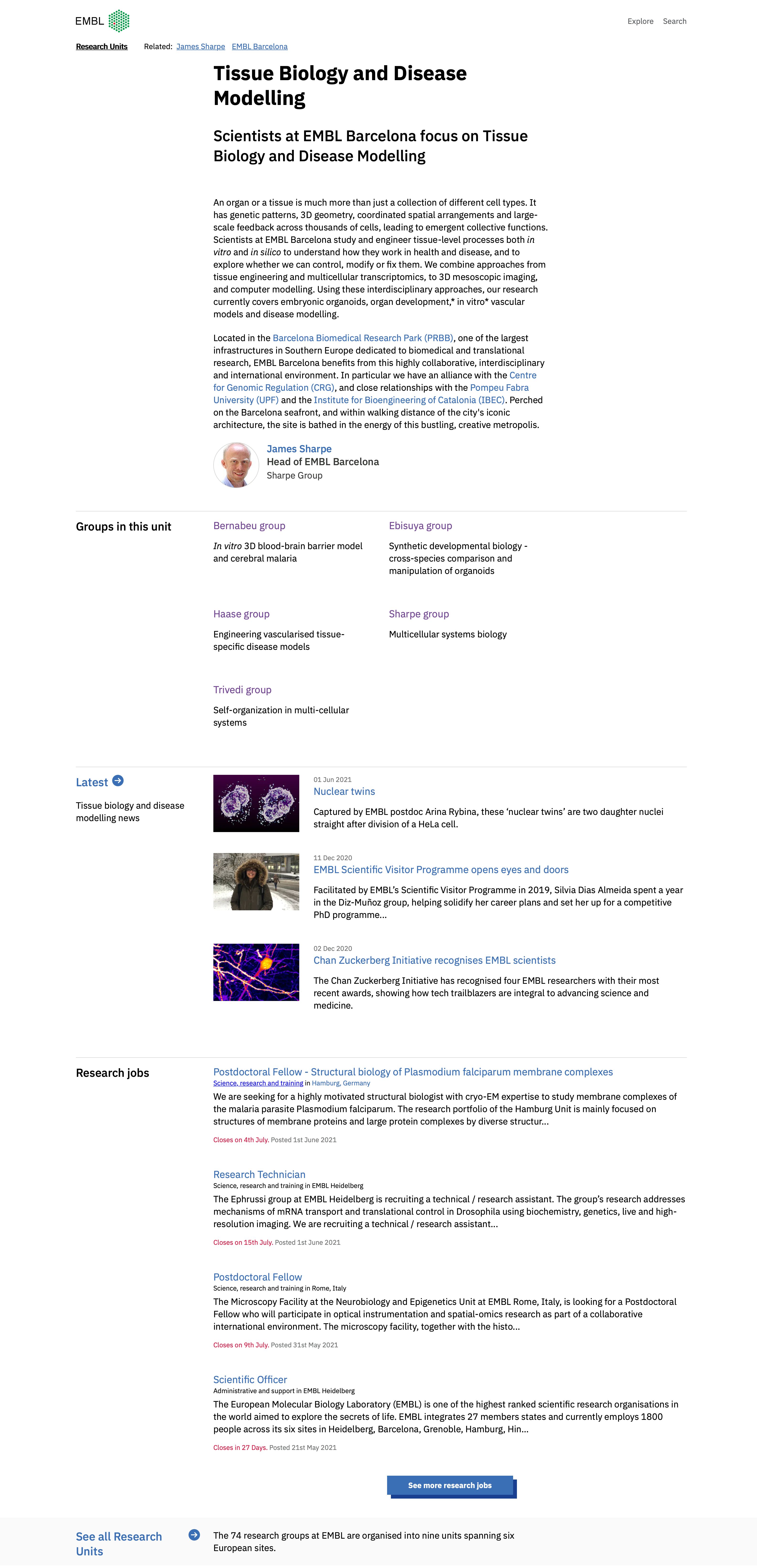
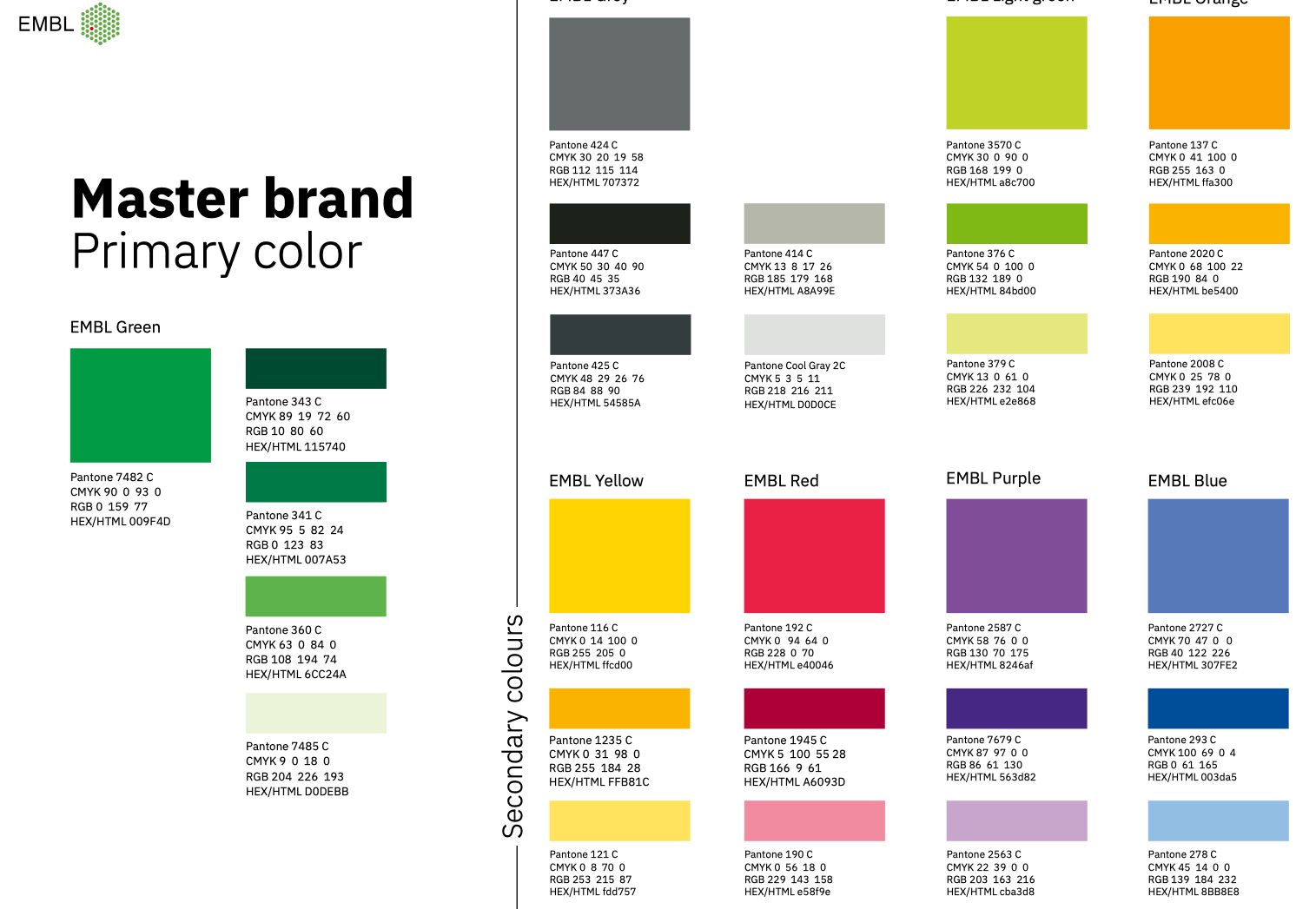
Early design concepts explored the application of the brand system fundamentals – typography, colour, iconography, illustration style – across the wide variety of user touch points. This was done in tandem with our colleagues in the print design team with a view to developing this system holistically.
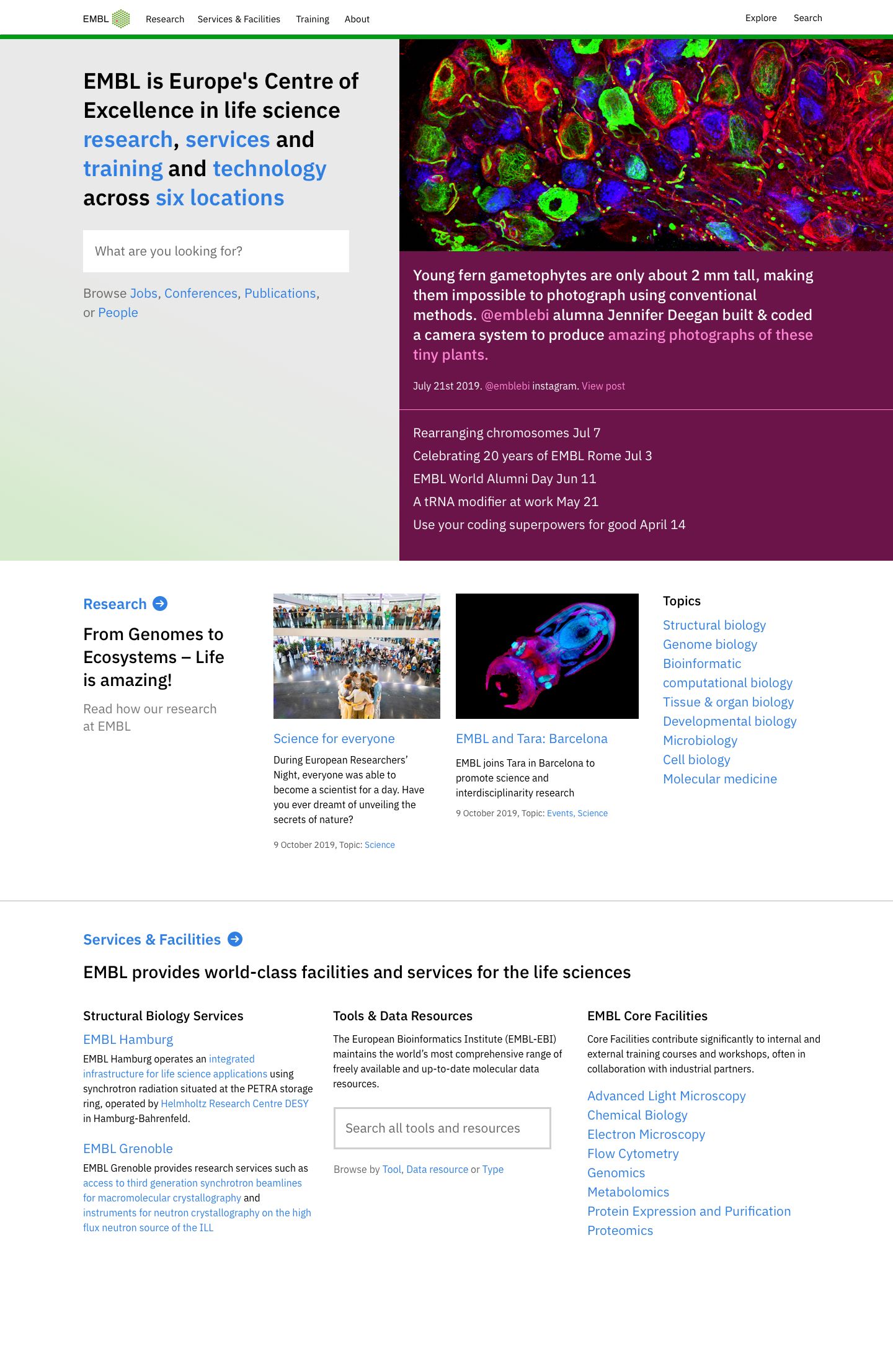
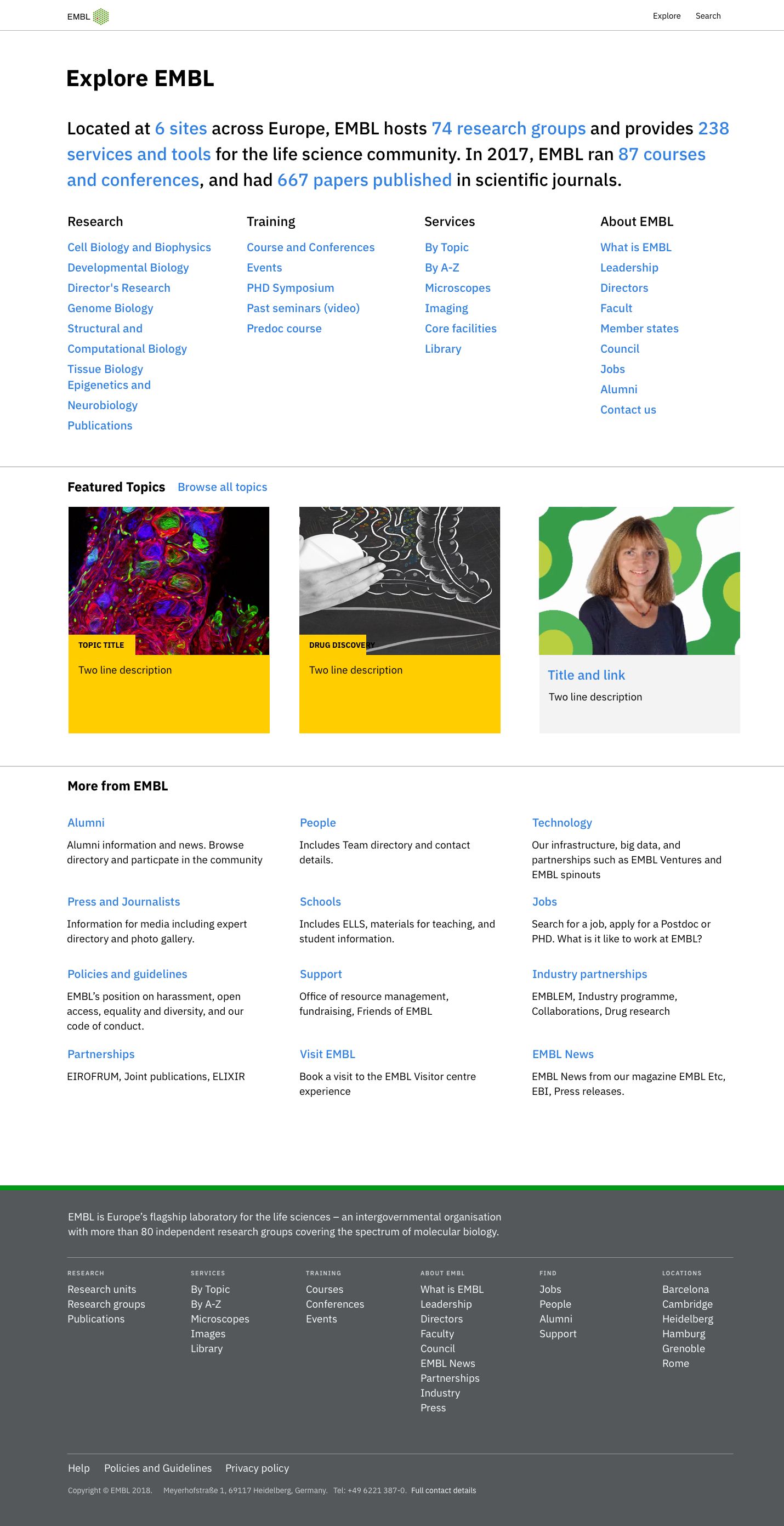
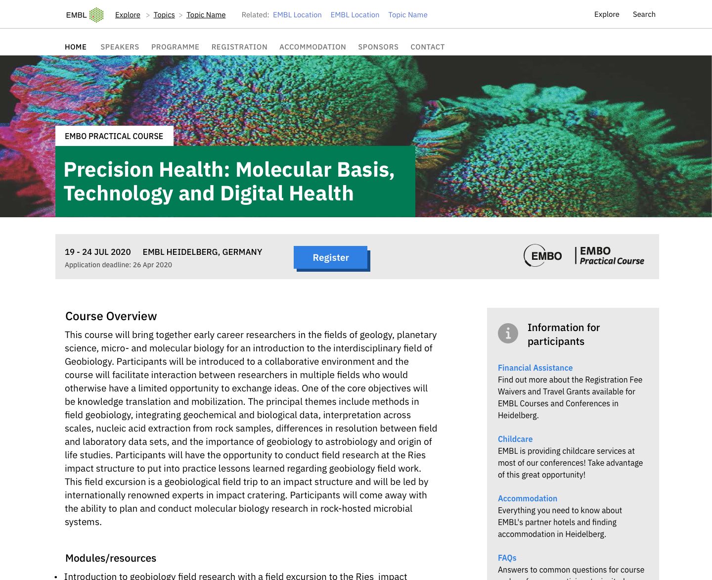
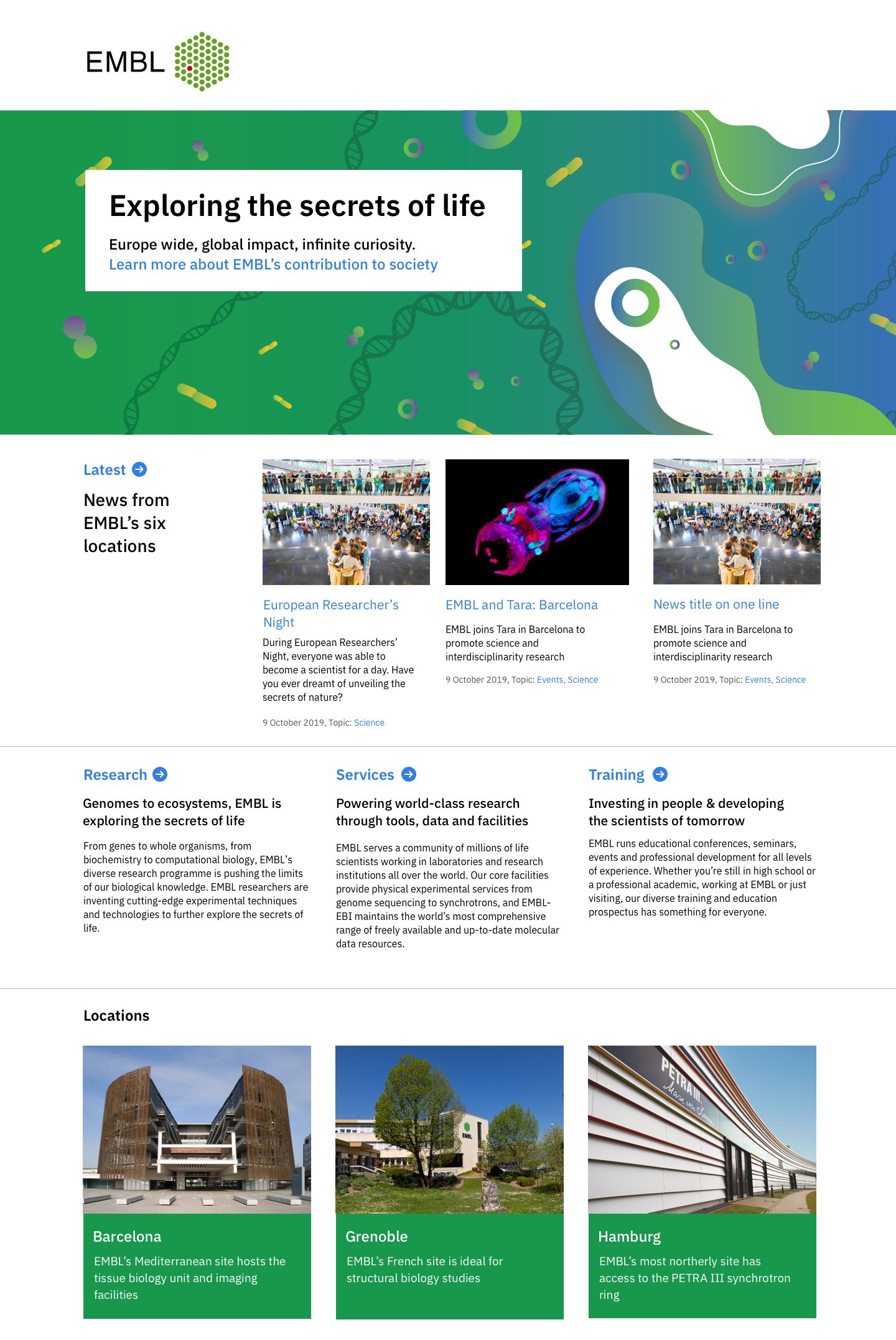
Global design language
A key component of our tactical response to the strategy was to expand the scope of the existing design system used at the European Bioinformatics Institute (EBI), part of EMBL, to encompass the whole organisation. One of the guiding strategic principles was we were one EMBL, and the design system would provide a way to unite the user experience across EMBL’s many devolved and siloed products, services, and user touch-points.
EMBL’s user needs are broad. There are life science researchers and teams – internally and externally – using web-based tools, or complex visualisations. There was website for each research group or team. Event websites for the conferences and training events EMBL hosts. There were many applications used by the organisation. There are social clubs, restaurant menus, or meeting room booking systems. As a research scientist, you can book time on a microscope, or order a special kind of mouse. There are many, many touchpoints.
The design system we built had to accommodate lots of design patterns, and support lots of user behaviours, but one key aspect was it had to be flexible to adapt to products and their audiences.
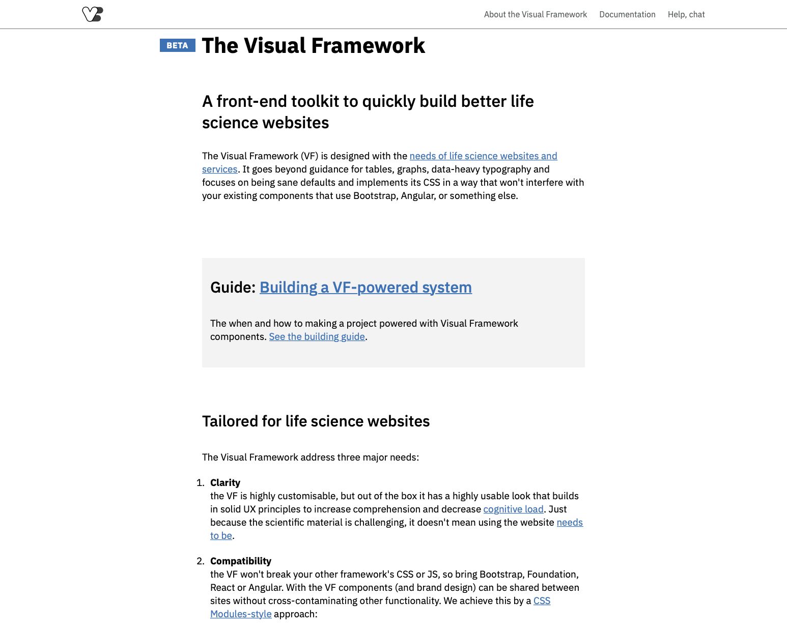
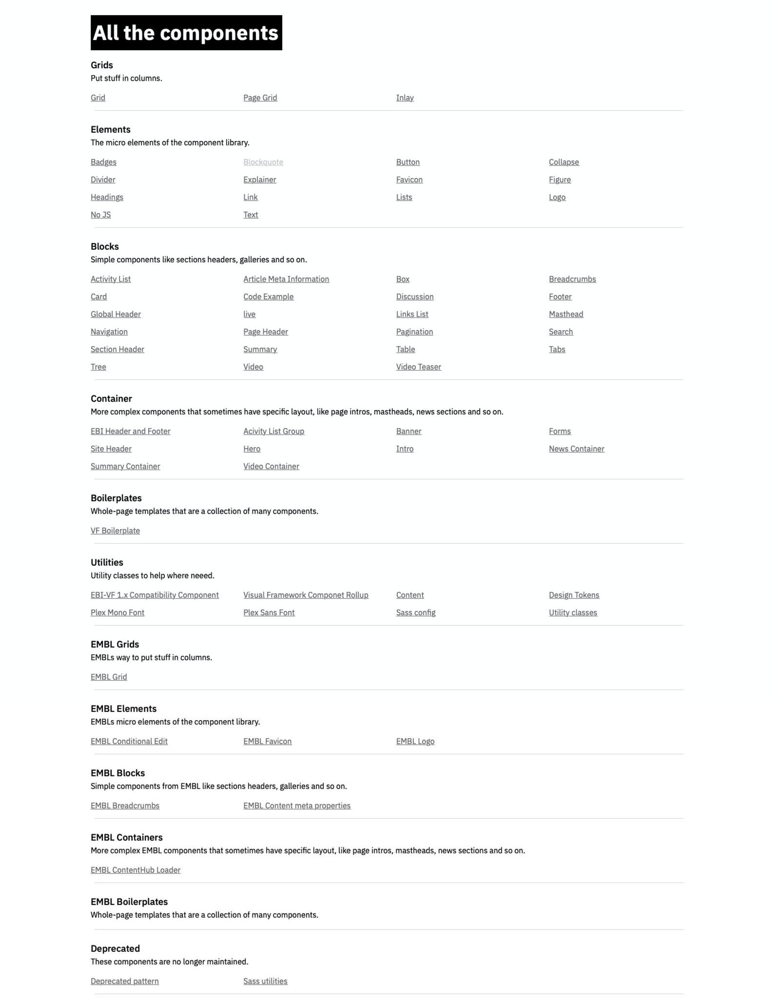
We developed a comprehensive pattern library and toolkit derived from the existing embryonic system, auditing user needs, and establishing new patterns.
New design system
- New design system delivers to many needs across three major 'brands': EMBL, EMBL-EBI, and 'Vanilla' for use with many third party consumers of the system.
- Developed holistically, and in tandem, with offline brand and marketing applications. All medias and channels informed each other.
- System incorporates a dialing up or down of the EMBL brand through use of component variants, design tokens, tooling and templates.
Working closely with colleagues in Design – who were responsible for the branding design system, and produced all of EMBL’s offline collateral – we co-developed the new branding system. Starting with design principles, and working our way out to the foundational elements such as typography, colour, iconography, and usage of photography and illustration. Developing the system in this collaborative way ensured a mutual understanding of the elements and how they can be adapted from one application to another. This ‘dialing up, or dialing down’ of the brand was a critical concept to realise in a codified way in the design system.
Mark was the catalyst for a transformative approach to EMBL’s use of design online. With his talent, he established a vision for web presences beyond our traditional use of functional patterns and enriched them with aspirational emotion. To implement this required exceptional design vision, skill and an ability to steer the organisation's people and hundreds of services, websites, and microsites towards addressing foundational challenges.
Ken Hawkins, Lead Web Architect, EMBL
Publishing platform
The old EMBL websites were run from a proprietary content management system which was due to be decommissioned. In my experience, almost all commercial, large scale redesigns end up being a CMS platform upgrade as well. Either that, or another piece of software is added to an ever-complex stack of technical debt. In EMBL’s case, it was decided to build upon existing architecture present in other parts of the organisation and use the following:
- Headless Drupal installations for the managing of content, data, and relationships.
- Organisational data, such as Jobs and People, would come from enterprise data sources and largely from other enterprise systems such as SAP.
- We'd use Wordpress for our microsite solution because of its superior editor experience and large, open source community.
- A static site generator was used for small one-off page builds, or for those instances where content would not change much. For this, we chose Eleventy because it's based on Node, fast and lightweight, and very scalable.
Core to our design system principles, we then ensured the design system was in the hands of our users – and not just developers, either. For editors, and site builders, we wanted to ensure they had the best tools available to build on-brand digital products.
The design system components were built using React and available to Wordpress users within the Gutenberg editor experience. This included live previews of data fed from our content API’s to retain the what-you-see-is-really-what-you’re-getting experience within Gutenberg.
Outcomes
- New content API architecture for all enterprise data.
- Delivered automated deploying of Wordpress sites for building flexible, on-brand microsites with integrated enterprise data integration – such as people, and jobs.
- Delivered React-based component library usable through Wordpress' Gutenberg interface.
- Delivered an Eleventy-flavoured starter kit for static site building incorporating the design system.
What next?
The delivery team at EMBL continues the hard work of collaborating across the organisation to apply the system to the digital ecosystem. Right across the institute, siloed products, teams, and services are benefitting from a unified design system and brand architecture that allows for individualism and creative control built on easily communicable sound foundations.
