CERN
CERN The home of the Large Hydron Collider, the experiments that discovered the Higgs Boson, and the place where the World Wide Web was created.
I was asked to lead the project over three years to recreate the CERN website in readiness for ‘one of the most important scientific discoveries ever made’: the discovery of the Higgs Boson. CERN knew their website was currently not up to the task of delivering this message to humankind in the way it needed to be. We had a lot of work to do.
The project was blank canvas; a complete redesign, a new publishing platform, new content architecture and proved to pick apart process and organisational challenges of how CERN created, maintained and published content.
We started with extensive user research over a six month period. This included a healthy research mix of large scale quant, and several initiatives of qual including the many users and audiences of CERN. We needed to get to grips with who was coming to the CERN website and why. The difference with this project compared to others was the sheer scale and breadth: CERN was, literally, for everyone. Scientists, engineers, school children, the family who live on top of the collider. Their needs were broad and establishing trends in these needs was the key to making a start on the strategy.
Content strategy
With such a breadth of content, my job as Creative Director was to ensure that the display of the content is appropriate for the user and the task at hand. This presented a challenge for the designers and stakeholders. How do we make decisions on how something should look? Ever mindful of subjective opinions, I always try and systemise how something should look. Once we all agree on the system, it should provide us with the rules and guardrails in order to make good decisions. This is especially important if other people are going to be creating something with the system.
We saw in the research that there were two opposite poles of user need and how it might relate to the visual design. Scientists used the website purely as a tool - getting from A-B with upmost efficiency. They expected hard data and science. Lots of content and links. Small typography. The ‘general public’ user, though – perhaps who arrived at the CERN website from the BBC News website – did not want that at all. They came for information, sure, but they wanted that wrapped up in an inspiring aesthetic. Something that would communicate the work CERN did.
The 'wonder' scale
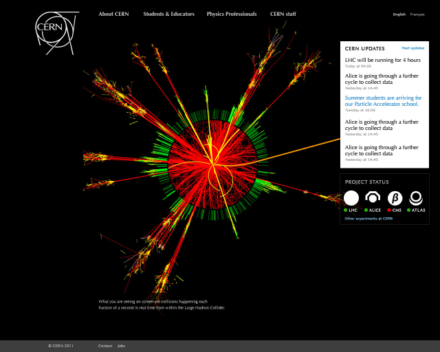
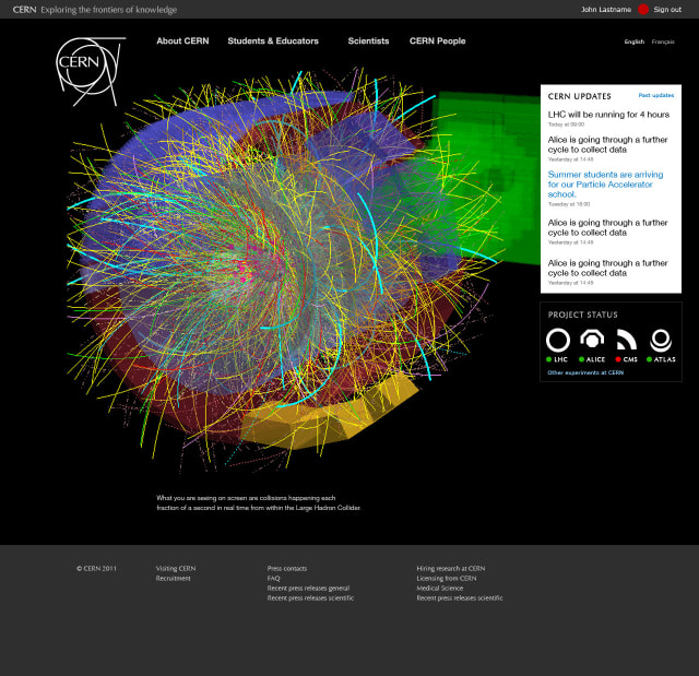
We created what we called ‘The Wonder Scale’ for this. A numerical scale which we attributed to pages of content, chunks of content or functionality, or entire services at CERN. A ‘high wonder’ meant it was written in a certain way, we’d include inspirational and informative imagery. For ‘low wonder’, we’d focus on typographic efficiency. Few images would support the content. This was about the reading experience for the users.
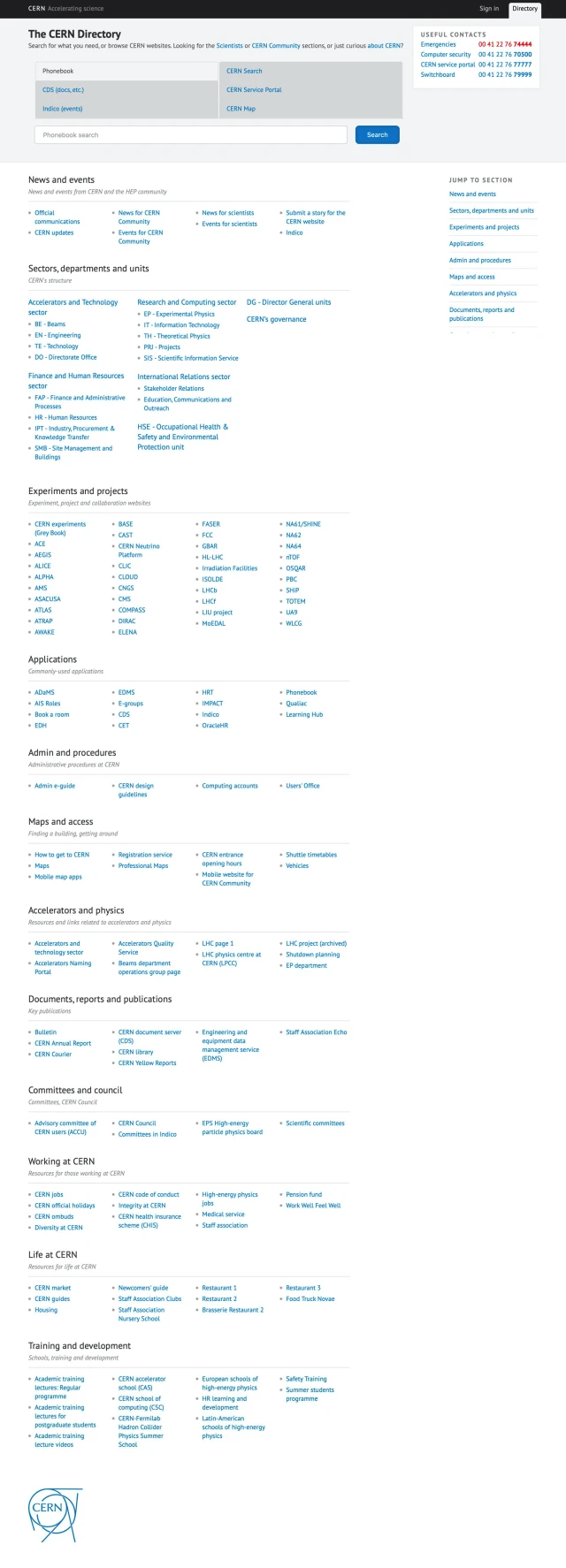
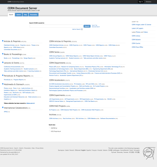
'Low Wonder' pages – The Scientists index page and the CERN Directory. The Directory was only redesigned by us after being one of the first ever pages created at CERN many years ago. In fact, it was probably one of the very first web pages in existance.
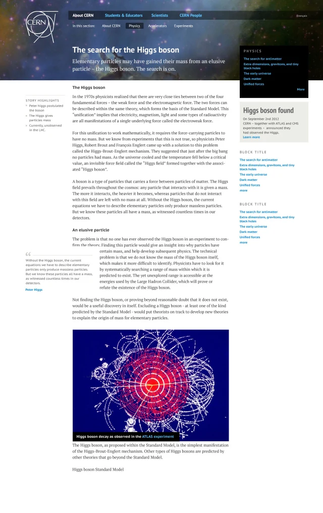
'High Wonder' pages – Sections of the website designed for the general public showed more imagery and was written in a more accessible way.
Design strategy
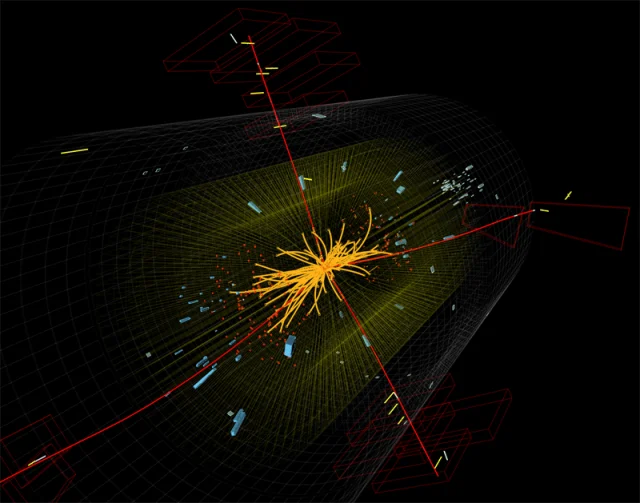
At the heart of the design strategy was to show the wonder of the work being done at CERN. During our research, we heard that other comparable organisations were places like NASA. The reality of experimental particle physics is somewhat different to NASA. NASA has amazing aspirational photography of space rockets, planets, and astronauts. CERN had images of big machines and not much else. It was lacking in beautiful inspiring images and didn’t have the resources to sustainably produce them.
After much digging, we discovered the amazing data visualisations being produced by the experiments at CERN. And, after testing them with users, we found that they hit the right emotional strings. We set about building a system that tied CERN’s image repository directly to the website for site editors to cherry-pick images.
Some of them were just so good they became a single image on the homepage and the whole design strategy delivered on the simple user need: ‘Show me something amazing. Then show me what’s happening at CERN’
A broad ecosystem
CERN is home to tens of thousands of collaborators.
Each of them can have their own website. So can the teams they belong to, the experiments they work on, and the services and tools they use.
CERN is like a huge university. A hack-day on a grand scale. To support this culture there are hundreds of clubs, societies, and meet-ups. They can all have a website too. And, before we started tackling this problem, they just went to IT and asked for one. They could do with it what they wanted. Of course, this presented a challenge to CERN from a policy perspective. But it also presented a problem for the users and for IT – there was no on-ramp. No help was provided. The users were just handed a fresh Drupal installation that that was that,
We had to devise a strategy for scaling the design system, at the same time as minimising pain for users and IT, whilst delivering against increasingly strict policy guidelines.
The Drupal Theme
After much experimentation, user research, and prototyping, we settled on the following:
- A new Drupal theme. When IT provisioned a new site for someone, they we only allowed to use this theme.
- As such, the new theme had to have several design ‘levers’ which the user could use to make it their own.
- This new theme was incredibly simple. It included a few design patterns for navigation and page layouts, in addition to comprehensive content styling.
Application across tools and services
... and the public website
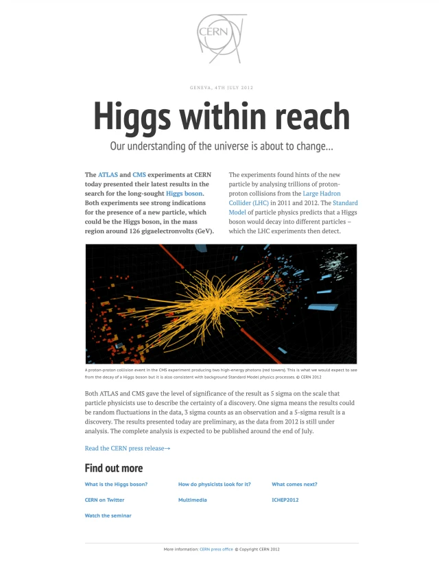
The Higgs Announcement
In 2012, I received a call from the Head of Communications at CERN asking me to set aside some of my studio’s time to work on a very important project. But I couldn’t tell anyone.
And neither could they.
We went on to work on the roadblock homepage for CERN that would accompany the press release and live stream for the discovery of the Higgs Boson. It was a momentous day and I still can’t quite believe I was involved in a small way in that project.