Sparkicons and the humble Hyperlink
The humble hyperlink is an incredibly simple, powerful tool on the web. In fact, many would say that our ability to link one resource to another via hypertext is what makes the web what it is. But, I think this humble link could do a little more than it currently does.
What’s the problem with links?
When the web was invented, the hyperlink linked resources together. That hasn’t changed. What has changed is the type of resource that may be linked. In the early days of the web, resources were documents of text. They then changed to images or tables of data within text, but it was still text. Now, an html document is still the resource, but the primary piece of content maybe something completely different: video, audio, a download to a file, it may be secure. A link may trigger an action along with linking, such as going fullscreen, a pop up, or linking to another site. All of these things are valid links, but we have just one element with a bunch of attributes in the code to describe them. I’m not so sure it’s enough any more.
What do I get when I get there?
It’s correctly marked up in the HTML, but perhaps badly framed editorially. You, as the reader, do not know what that destination is until you click it. ‘Just make the link text better’, you may be saying. Ok, how about this:
Here’s a great article about cats
That’s better. It’s implying a link to an article. The meta data for the user expectation of this content is in the content itself. But, we can’t always rely on our content creators to reliably do this. And what if the content was more complex, like a report:
Is this a link to a web page, a PDF, a word file, a link to download an app from the app store? What is this?
And that’s the issue. I’d like to know what I’m getting before I click it. I think we need more meta data around our hyperlinks that can give us more of an indication what we’re getting before we get it. I became painfully aware of this just a couple of days ago when I clicked a link and started downloading an HD video, over Edge, that started auto playing. Luckily I wasn’t on data roaming at the time.
How can we give more meta data with our links?
There could be a few ways we could do this. Obviously, we could just write the type of link, destination and other stuff in the content. But, if that destination changes somehow, that’s an added overhead for the content creator. Plus, you could end up with quite verbose link texts.
We could use the <type> attribute introduced in HTML5 to specify the Media type (formally MIME type) of the linked document. This is exactly what we should be doing, actually, but the options don’t necessarily map to our content needs, or provide all of the content type requirements. For example, I may want to link to a video, as that’s what I want the reader to watch, but the HTML resource is not a video at all, but a video embedded in an HTML page with a whole bunch of other things. In that case, the <type> attribute would be inappropriate. The same could be said for audio, or any other primary content that is embedded within an HTML document.
I feel we need two things: some visual affordance for the user that they’re going to a particular type of content; and this affordance is rendered through an attribute, or something similar, in the HTML of the link.
We’re already doing this. Sort of.
In designing around this problem, I’ve noticed through my research that we’re already doing this. We already have conventions used on sites like Wikipedia, and others, for indicating, after a link, what will happen when you click it. Here’s are two examples from the BBC and Wikipedia.
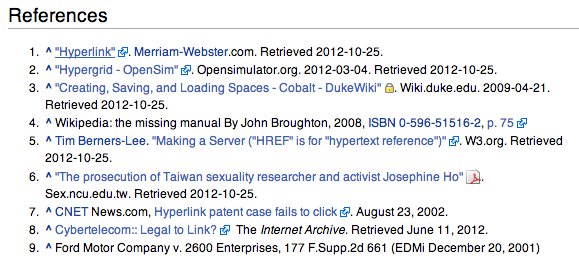
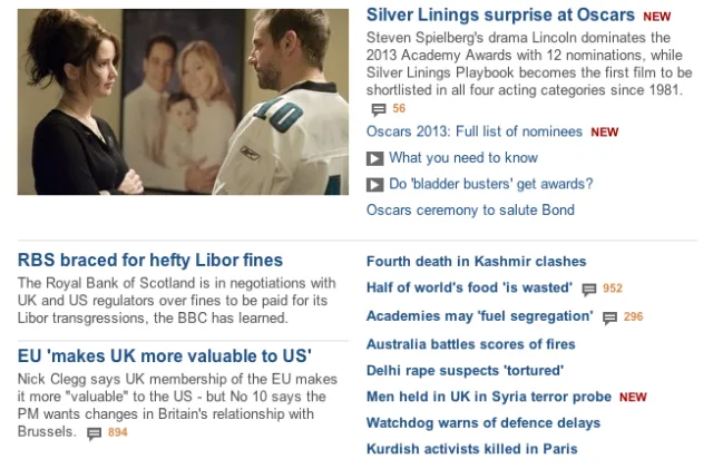
Typically done with CSS or Javascript and it just includes an icon after the link. But, that’s it.
The thing is both of these examples use the icons to append list items. They’re not in paragraphs immediately following the link wherever that link may be.
Sparklines
Like Jeremy, I like Sparklines a lot, too. Edward Tufte describes them as:
…a small intense, simple, word-sized graphic with typographic resolution.
Sparklines are efficient representations of complex data that typically sit within content to provide additional semantic value to the content. They’re a small hit of additional information. A picture speaking a good few words.
And I think he’s onto something there and it’s something we could use for this problem.
Sparkicons
What would it be like to expand on what we have now? How could we provide more meta data – where appropriate – than just an icon as demonstrated on Wikipedia and the BBC.
What we could do, is include some more information, for quick visual digestion, alongside an icon. We could take Tufte’s Sparkline rationale and apply it to this small, inline iconography. We could use a Sparkicon.
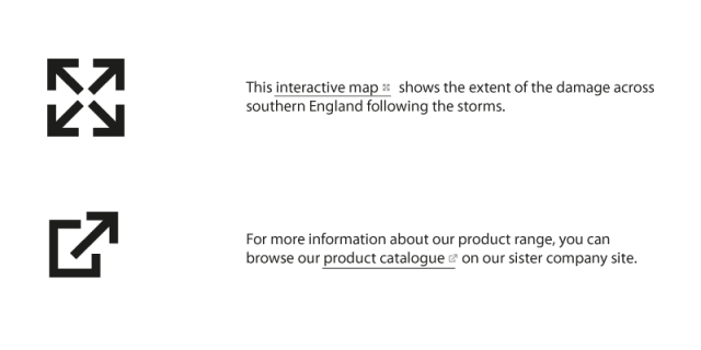
I’m defining a Sparkicon as a small, inline icon with additional link meta data to describe either the content and/or the behaviour when the user clicks the link.
I’ve looked a couple of examples of how this might work. The first example shows two icons to indicate behaviour when we click the link. The first is a full screen icon, the second is one we already know: an ‘external site’ link.
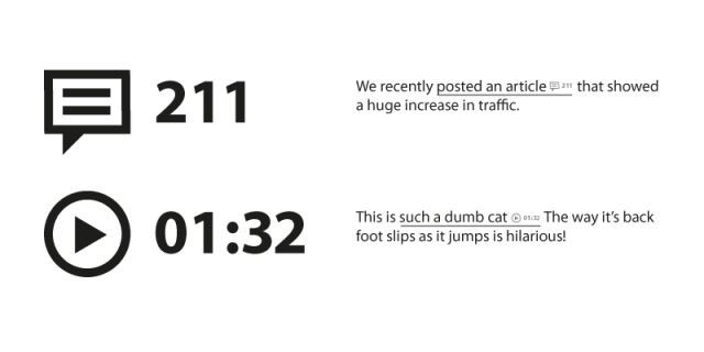
The second set of examples are icons for particular content or media types: comments and video. The comments includes a count of existing comments attached to the link document. The video spark icon includes a video duration. This could also include things like aspect ratio, or HD, or whatnot.
Degrading the reading experience?
I think the challenge with sparkicons would be to give enough feedback to the user to let them know what’s going to happen, or where they’re going to go, or download and what are the consequences of clicking this link. That’s the important thing, and history tells us we can’t rely on the words to do that.
But we also need to be mindful how much of an interruption this will be to the ebb and flow of reading long form content. Also, how much added visual noise would this add? At this point, I just don’t know, but I plan on putting this to test soon on a couple of projects: both personal and professional.
There are plenty of challenges, particularly how this could just be some kind of applied graphics through a simple addition to a link attribute. Standardisation is also an issue – this type of icon would be only really useful if it’s a shared convention.
But, it’s just an idea right now that i’m plugging away at. More to come.
Updates: Joe Gooden pointed out on Twitter that this of course is of particular importance on touch devices where we do not have the benefit of hover interactions (such as Alt text reveals), and status bar
Tags that this post has been filed under.