Don’t screw with conventions
I’ve got a confession to make: i’ve got a thing about signage design. On any given day trip, excursion, or holiday, and I can be seen ignoring the attraction and taking photographs, or even drawing little sketches, of the signage. I’m particularly interested in airport signage.
A few days ago, I took a business trip to Brussels, via Amsterdam’s Schiphol airport. I’ve wanted to visit Schiphol ever since I attended a lecture in 2005 by the designer of the signage system, Paul Mijksenaar. As a designer, you know when you get those moments where something somebody says turns you’re entire understanding on its head? Seeing Paul talk, I probably had one of those moments every minute.
Schiphol vs Cardiff
Cardiff International Airport has, without doubt, some of the worst signage I think I’ve seen. I’m not sure what constraints (or lack thereof) where placed on the designers in order to produce these. I mean, white Arial on blue lozenges? All the same, regardless of content. Honestly, it makes for a navigation nightmare.
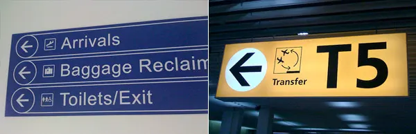
Cardiff International Airport signage (left) compared to Amsterdam Schiphol airport (right). More photographs of these are on Flickr.
Thank goodness Cardiff is not often used for transferring flights, like some of the major hubs throughout the world. Case in point, on Tuesday, in Schiphol Airport, I had 25 minutes to:
- Take a leak
- Change Terminals
- Xray my hand luggage again
- Find some water to buy
I was running in-between each of these tasks to make sure I didn’t miss my flight to Brussels. Without clear signage, in the place I expected them, I would have missed my flight for sure, and may have wet myself along the way.
Schiphol has some of the clearest signage I have seen in any airport (in fact, its signage system has been copied by several airports, London Heathrow included). It is designed around some extremely simple rules (Paul explained some of these in his talk a while ago), the three that stood out for me were:
- Conspicuity
- Contrast
- Task
Conspicuity is obvious. Make the signage stand out. They should compete with other things; architecture, or advertising. They should be high contrast. Most of all, they should help users complete their task. Paul mentioned three things that people want to do when they arrive at an airport (and this holds so true)
- Go to the bathroom
- Find my gate
- Get out of the airport
On arriving in Cardiff on Wednesday evening, it took me a good ten minutes to find the bathroom. Ten minutes! This was because the toilet signage was ingeniously attached to a wall facing away from the prevailing traffic through the baggage reclaim hall. A genius bit of wayfinding that is.
Parallels with web design
It’s not difficult to draw parallels with airport signage (in fact, most wayfinding systems) and website design. Good signage should enhance a user experience, it should help a user complete their task, and it should do it in a way that is unobtrusive.
Over on Paul’s website, he has some fantastic gems of design advice. These are written in a context of designing wayfinding systems, but they could also be applied to a multitude of other media:
Colour Coding
Should reinforce a category of information that is equally clear without colour coding.
A no brainer this one, but it’s amazing how often colour-coding is abused.
Jargon
Assume that all visitors know nothing about the airport. Select terminology geared to users rather than concocting clever airport gibberish.
To be honest, I’ve not visited an airport where they’ve used their own jargon. Of course, there are cultural differences. For example, I’m sure I’ve seen a sign for ‘Bathroom’ in a US Airport. As a British bloke I’m sure this would make it difficult to find if I was in the muddled state of badly needing a pee.
Maps
The number of passengers capable of reading (and correctly interpreting) a map is negligible. By and large, maps are display windows for the presentation of airport facilities and not substitutes for signposting.
I hate maps. Hate them. Why is it, in any attraction/shopping centre/airport, the designers of maps see it as a creative exercise? I’ve lost count of the amount beautiful isometric maps that are completely useless.
Fonts
Only graphic designers show interest in fonts. Do not use more than one font and, unless you have plenty of time and money, stick to Frutiger, Clearview, Gill or Meta
This one made me chuckle, but he’s got a very good point. Take Cardiff for example. Arial? Why? Why not use Clearview, or Frutiger. Why use a font that is an inferior knock-off of Helvetica that is less legible as a signage typeface? Licensing? Probably.
Illuminated signs
Don’t save money on lighting. All primary signs require built-in lighting. The sunnier the climate and the more daylight available, the bigger the need for illuminated signs.
I don’t think any of the signs in Cardiff airport where illuminated (although I may be wrong on that).
Pictograms
Don’t expect too much of pictograms. Always add text to less generally known functions.
This is another little beauty and can be applied to web design with regards to icons. Don’t expect too much from them.
Put it to the test
Test all ideas that deviate from the standard solution.
This must be the number one recommendation for signage, but note the closing words. But, that said, testing standard solutions can always solidify thinking and may throw up the odd surprise.
Some wise little nuggets of design advice.
There are more photographs of airport signage, good and bad, on the aptly named Airport Signage, Airport Signs and Pictograms, and Signage Systems Flickr groups.
Tags that this post has been filed under.