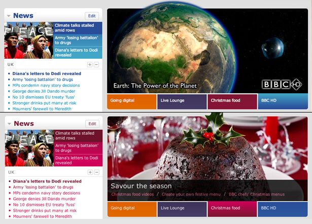
BBC redesign tellys have rounded corners, right?
The BBC have redesigned their homepage.

Web 2.0 design nonsense
This is a shame. The BBC, in design terms, used to be a leader in the field. In one fell-swoop, they’ve turned follower. The trends, from a few years ago, are all over this thing. From the ‘Beta’ label and the rounded corners, to the gradients. Why? I honestly can’t think of a sensible response as to why they’ve gone down this route. Hasn’t Facebook proved you don’t need to have reflections or curved corners to be ‘Web 2.0’?
Now, I’m well aware I’m judging this on face value. I’ve not been privy to any discussions that may or may not have taken place.
However, Richard Titus—The acting head of User Experience at the BBC—has kindly written a blog post describing some of the specifications and requirements.
High on this agenda was ‘widgetization’ (oh, I hate that word) of the content. Dynamically generated and syndicated content has been high on the content priorities for the BBC for many years. What puzzles me is why jump on a visualisation bandwagon? Recent newspaper designs, such as The Times, or The Guardian, deal with top-level content in a similar way. To all intents and purposes, the modules on their homepages are ‘widgets’. Perhaps it is that word that makes designers want to recreate netvibes.
Innovation over information?
I’m sure there are plenty of clever things going on under the hood on this homepage. From Ajax, and a move towards PHP, through to localised content and user customisation. My gut feeling on this, and this is a personal view of course, is that all this visual guff gets in the way of the information. The design aesthetic is not ‘simple, and beautiful’. It’s obtrusive and dated.
My lecturer in university instilled a mantra into me: ‘don’t let the type get in the way of the words’. It can be applied to any design. Don’t let the design get in the way of the information, or the problem you are trying to solve. Sure, enrich the user experience by delivering the information in a fulfilling environment, but make the clever stuff invisible.
An example of this is when you click on the four coloured tabs running underneath the main promo. Now, how does that make you feel? Confused? Surprised? Sick?

Why did they do this? Really, what is the value here? To showcase the power of CSS? I’m totally baffled.
The last of the weather icons
The weather icons also breath their last with this redesign. I’m sad about that. Not because they look worse, but they are an inferior solution.

On TV, the richer weather graphics are far more useful in actually illustrating weather forecasts, but on the web, when there is no animation, we’re left with icons that mean nothing without the words to describe them. Of course there is an accessibility reason for having the text. However, the text shouldn’t be there to prop up bad icons. I mean, is that one in the middle cloud, or fog?
Anything good to say?
There are some nice things about it though. The buttons work well. I think the on/off state is very tactile. And, like Jeremy, I love the analogue clock in the top right.
Dinosaurs designing websites
What strikes me most plainly about this design is how the effect of a big, lumbering organisation can impact on a redesign. A good few months ago, or maybe years, when this proposal was first taking shape, it was probably the time when curved gradients, reflections and like were at the forefront of the ‘web 2.0 aesthetic’. Thing is, it takes any large organisation ages to get their shit together. Which is why designing to visual trends such as this is so risky. If your organisation can’t react quickly enough to keep up, then go the classic design route every time. If you don’t, your design will look dated within months. Or, in this case, even before it’s launched.
I’m led to believe this project took three months to complete. And I go back to my initial comment, it’s a huge result that the team responsible for this managed to get this project to this state in that time. In fact, it’s pretty miraculous. We’ll see how things pan out over the next few months. But, like some other websites that the BBC produces, they seem hell-bent on trying to make the web like telly.
But tellys have rounded corners, right?
Tags that this post has been filed under.