New look Guardian
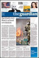 Today sees the launch of the new Guardian newspaper here in the UK. I’m pleasantly surprised by the amount of column inches and airtime a redesign of a national is getting. Not only do we see a change to full colour, but an entirely new format for British Newspapers and a entirely new grid system design and typeface. Pretty much everything then.
There are several things which will upset people straight off with this new design. First of all is the Masthead.
The Masthead
The original Guardian Masthead, designed by David Hillman in the 80’s, clearly communicated the paper’s ‘brand’. Elegant Garamond mixed with with a hard, emotionless Helvetica. Traditional broadsheet values with left-wing modern thought. You knew what you were getting yourself into (which is why I don’t generally read the Guardian).

The new Masthead still retains the visual seperation of the ‘the’, although only in tone this time. It’s set in the new Guardian typeface, the rather unimaginitive named ‘Guardian Egyptian’, which I feel brands the paper as more middle of the road. There certainly is less distinction now with other mastheads such as the Independent or The Times.
The Colour
Not much to say on this really. The paper is now full colour, which is great and will hopefully see an improvement in the photography as a result. In fact, in the centre spread of this mornings edition, there is a full colour spread of just one photograph which does look fantastic.
The Typeface
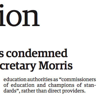 Up until yesterday The Guardian used a mix of three typefaces - Helvetica, Garamond and Miller. Today, the paper uses just one - the newly designed Guardian Egyptian.
I think I’m a bit sad to see Hillman’s inspirational typographic design go. I’m not the biggest fan of the paper in terms of content, but the design was always fantatsic. Really great typographic design. The new typeface is ok, although some of the letterforms in the lighter weights bug me, such as the lowercase c (there’s a strange bulging going on). The heavier weights however look really good. Clearly legible at very small size and obviously designed to take into account the poop paper quality and a certain amount of bleed from the ink. A sharp looking serif, modern and very legible.
Overall, I like it.
The Size
Now this is the thing which is causing the biggest upset. For many years The Guardian was a broadsheet. Now if you talk to a broadsheet paper journalsit they often get a strange look in their eyes when discussing this paper format. The Broadsheet is steeped in history, and I for one hope it doesn’t go away entirely. But. Broadsheet papers are a pain to read, wherever you are. Even on the couch.
Over the past few years a few of the broadsheets in the UK, most famously The Times, have moved to a tabloid format for the daily (the Sunday paper is still Broadsheet) and as a result has seen their circulations rise whilst the Broadsheet papers (The Telegraph and The Guardian) has seen their circulation fall.
So, the Guardian has decided to go smaller, but not Tabloid. They’ve decided to use the Berliner, or Midi, format. The format is about as wide as a Tabloid, but taller. I think one of the major reasons for this was to set The Guardian apart from the competition, to give it a different feel (possibly to distract from the watered down redesign). Also, I feel this gives The Guardian a more European feel as there are a few papers on the continent which use this format (Le Monde in France and La Repubblica in Italy).
The Grid
With a new size, comes a new grid. The Guardian sports a clear 5 column grid which is certainly a lot clearer than the old broadsheet grid. The column measure is slightly wider, which lets the new typeface breath a little. I feel the majority of broadsheet column measures are just too thin, this new design seems just about right.
Overall Impressions
A little watered down design wise, certainly not as distinctive as before. Great to see full colur. Like the new size although it’s a shame that we see another broadsheet disappear.
You can read all about the redesign on The Guardian website
Tags that this post has been filed under.