Five Simple Steps to designing with colour part 3: Colour combinations
Colours chosen from different spokes on the Colour Wheel will provide a variety of colour combinations. Deciding upon and selecting a colour combination that works for you will very much depend upon the job at hand.
Will it communicate what you want it to? Or are you just choosing them because you, or the client, like them? These are very difficult questions to answer because any designer or client will let their personal style and preference interfere with their decision-making. Colour combinations tend to evoke certain reactions either by cultural, or personal experience. Understanding these experiences will help you create colour combinations that tell a story. That is what good colour theory can give you; designs that tell a story.
I’m going to go over a few combinations here to demonstrate my thinking. But before I get onto that, it’s worth noting how palettes can be presented to potential clients or in design documentation.
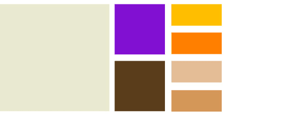
I’ve always presented palettes in two different ways depending on the amount of colours. In a broad palette, with many colours, I display these left to right with dominance and usage being denoted by the size of the square, or block, of colour. For smaller palettes and combinations, I use the rectangle containing a line and a square. I was taught this simple device in university but it is similar to many other examples I’ve seen. You can use circles, blobs, lines, squares. It’s up to you. The important thing is to indicate the relative weight of colour.

Colour palette showing range of colours and relative weight.
The colours within this combination (I was tempted there to call this a Triad. However, if you think back to the Colour Wheel, this is not the case. Just because there are three colours does not make this a Triad combination) are given the following names:
-
Subordinate, or Base colour. This is a visually weak, or subordinate, colour. It should contrast or compliment the dominant colour.
-
Dominant. The main colour. It is this colour which defines the communicative values of the combination.
-
Accent, or Highlight colour. The Accent colour can be two things: either sympathetic to the Subordinate or Dominant colour, or it can be visually strong and striking, therefore appear to be competing with the dominant colour. This can provide tension within a combination

Colour combination showing Subordinate, Dominant and Accent colours
Examples of colour combinations
Active / Vibrant
 Active combinations are intense. They feature bright, often complimentary, colours on the colour wheel and are combinations of primary, secondary and tertiary colours. To many people, colour combinations such as this evoke feelings of noise, flamboyance and energy. It’s a young combination, although there will be cultural differences, aimed at young adults. Many of the hues are not really ‘natural’ colours, but they are more intense tones of the same colours, therefore they could be used for ‘natural’ applications such as the travel industry.
Muted / Calm
 Muted palettes have a lot of white in the hues. This example uses blues and introduces lavender as the dominant colour. The resultant colourway is balanced and calming. Hues in the blue, green and violet areas of the Colour Wheel convey a visual quietness. The Accent is almost always used as sympathetic to the Dominant. Often used in the cosmetics industry, the visual softness of the colours often portrays a feminine quality.
Pastel
 A pastel combination is similar to the Muted combination in that is often based on colours containing a lot of white (or lack of white depending on your colour model right?). Where they differ is that Pastel combinations combine warm and cool tones readily. This combination can portray youth and innocence (babies!) and has a warmth that the Muted combination fails to deliver.
Natural
 Natural combinations are those colour which are borrowed from the great outdoors. Rusty reds, browns, sky blues and warm pinks are the order of the day. I find the easiest way to create these combinations is to go outside, take a photograph and then choose some colours from that, you really can create some stunning combinations. When you need to communicate rustic charm or the feeling of walking through autumn leaves, then this is the type of combination you’re after.
Rich
 This is a good one. Hues of royalty, tradition, often religious and above all; wealth. Rich colour combinations are perhaps the combinations which are so engrained in culture. True, the actual colours used may differ, but the overall effect is seen throughout the world. Maroon is often mixed with gold and full shades of green. They can be combined with Natural combinations for a fuller palette.
Part of the design solution
I hope I’ve indicated how important colour is in communicating part of the design solution. By selecting the best combination of colours you can go a long way to ensuring the success of your design. We’ve looked at some colour combinations here but what about the individual colours? They also have meanings and go a long way on their own to set the mood and tone of a given design. Next, I’ll move onto discussing colour and mood. What do different colours mean?
Five Simple Steps: Designing for the Web
This article is an extract from the upcoming book; Five Simple Steps: Designing for the Web. Available later this month.
Tags that this post has been filed under.