Five Simple Steps to designing with colour part 2: A few basics

In any book on colour I’ve read, this chapter was without doubt always the most complicated: Colour Theory. At its heart, colour theory is concerned with the creation of colour combinations via relationships. The relationships are created by the position of the colours on the colour wheel. The complexity of colour theory really kicks in when you start taking into account different hues, shades and tones. It can all get a bit too much. So here, I’m keeping things very simple and I’m starting at the beginning with primary colours.
Primary colours
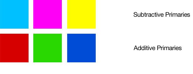
Primary colours
Primary colours can be divided into two different types: Additive and Subtractive. The additive primaries are those which are obtained by light; red, green and blue. They combine to form white and form the basis of colours on screen (your TV works in RGB, as does your computer screen). Subtractive primaries are those obtained by the subtraction of light: cyan, majenta and yellow. They form the basis for four colour printing and combine to form black, the K in CMYK.
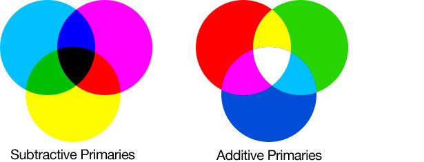
Primary colours overlays
The additive primaries combine (as shown in the diagram below) and where they overlap, the secondary colours, these are the subtractive primaries. The same happens when the subtractive primaries overlap.
The Colour Wheel
Now this little chestnut has been part of my life for about, ooo, twenty years. I remember painting my first colour wheel in secondary school. I had absolutely no idea why I was painting one (other than being told to) and how it would help me in my work. Even today, the practical use of colour wheels in every day design situations is questionable. However, the familiarity of a colour wheel will certainly help you understand where colour palettes come from.

The colour wheel
The colour wheel not only helps understand the relationship of different colours but also the classification of colours. It also, as I said, provides a quick reference to the primary, secondary and tertiary hues.
Primary, Secondary and Tertiary colours
The primary, secondary and tertiary hues are shown in the diagram below. As you can see, it’s pretty straight-forward to see how each is produced; Primarys combined create Secondary colours. Tertiary colours are created by combining a Primary and a Secondary. Things start to get interesting when you isolate different combinations of colours and this is when we get into the realms of colour wheel selections.
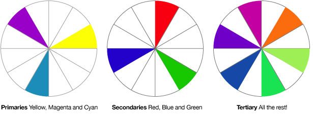
Primary, Secondary and Tertiary colours
Colour Wheel Selections
Colours, when selected from from the colourwheel in certain combinations, interact together. This is the basis of colour palettes; the interaction of colours. Knowing the basis of these colour combination types is essential in creating palettes. True, you can rely on gut instinct (as many designers do), but more often than not these decisions are based on experience of seeing these colour combinations everywhere in everyday life. Really, once you start to notice these different combinations, it will drive you bonkers.
Monochrome
Monochrome selections are simply one colour from the colour wheel.
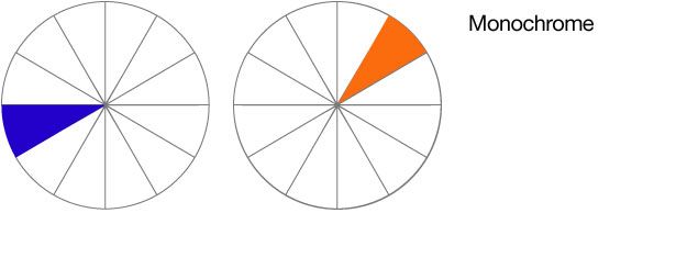
Monochrome colours
Complementary
Complementary colours are contrasting colours. Sometimes they look horrible, they can really not work. However, sometimes, they are just the ticket. I generally use them if I want a vibrancy in a palette or if I need to draw the readers eye to something. Hues of these colours work great as a highlight colour. They are defined by the colours opposing each other on the colour wheel.
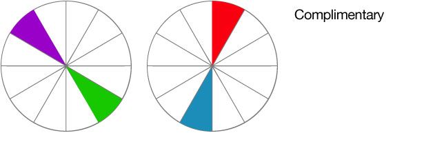
Complementary colours are opposing colours on the colour wheel
Triads
Triads are really interesting. They provide a real tension in a colourway as their strength is pretty much equal. Using triads in differing hues is where they come into their own though. Triad colours are any three colours which are equidistant on the colour wheel. As all three colours contrast with one another they can clash and this is where the tension is created.
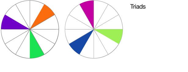
Triad colour combinations provide tension in a design
Other colour wheel selections
There are other selections which can be used to form palettes: Analogous, Mutual compliments, near complements and double complements. However, practically, I rarely use these conciously. Analogous colours for example are colours which sit either side of a selected colour on the colour wheel. Choosing these colours for example, is a fairly unconcious decision for any designer as they appear around us naturally so often (think similar tones in nature for example).
Coming up
So, now we have designing without colour and training your eye to see just tone, and we have the basic terminology of colour theory. Next up, we’re going to apply them to creating colour combinations; the basics of palette creation.
Tags that this post has been filed under.