Responsive Advertising
Recently at Mark Boulton Design, we’ve been working on a redesign of the global visual language for a large sports network. Like many web sites delivering news and editorial content, they rely on advertising for their revenue – either through multiple ad slots on the page, or from video pre-rolls.
Early on in the project, we discussed Responsive Web Design at length. From an editorial and product perspective, it makes perfect sense. Who wouldn’t want their content adapting to a device their reading it on? Who wants to pinch-zoom again and again? From a business and product perspective, we’ve seen this from multiple clients who want to take advantage of certain interactions on certain devices – swiping for example – for users to better engage with the content in a more native way. All good. And then advertising comes along and things get challenging.
Here’s the problem as I see it:
- A large number of sites rely on advertising for revenue. Many of those sites will benefit from a Responsive Web Design approach.
- Web advertising is a whole other industry.
- Ad units are fixed, standardised sizes.
- They are commissioned, sold and created on the basis of their size and position on the page
- Many ads are rich (including takeovers, video, pop-overs, flyouts and interactions)
Let me go through each one of these in turn:
A large number of sites rely on advertising for revenue. Many of those sites will benefit from a Responsive Web Design approach.
The content for free expectation on the web has been around since it started. Many websites – where you pay for the content in other forms, such as newspapers – had to adopt this model, but use advertising dollars to pay for it. With the absence of any other revenue stream on these sites, the only other alternative is paywalls/subscriptions, and we’re seeing a few of these start to come through in mainstream newspapers now – The Times, for example.
As I mentioned earlier, many of these websites will benefit from a responsive web design approach. The consumption of this content has changed along with the plethora of devices and viewports. As I’ve talked about before, designing a ‘best fit page’ is becoming increasingly challenging if you acknowledge how usage has changed and will continue to change in the coming years.
Web advertising is a whole other industry.
There are sub-industries within web design as a whole that generally don’t talk to each other – such as gaming, gambling, porn, seo. Web advertising is another. These sub-sets each produce technology advances that everyone else benefits from. They deeply understand their audiences and how they interact within those verticals. But they don’t talk. Generally. For an industry that is built upon open standards, sharing, communication then this can be damaging.
Ad units are fixed, standardised sizes.
Hurray for standards! Because of the inherent reuse of advertising colatoral, this stuff had to be standardised. The Internet Advertising Bureau has been documenting emerging standards in web advertising for years now.
This is all good, especially for creating grid systems. Khoi Vinh talked about deriving a grid from an ad unit (PDF slides) when I shared a stage with him in SXSW in 2007. They are a fixed content element – unchangeable and standardised across a website. They’re knowable.
They are commissioned, sold and created on the basis of their size and position on the page.
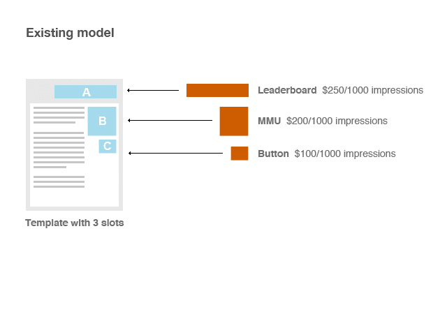
This is perhaps the biggest issue for me. For example, a sales teams basically have a page ‘template’ with ad slots. Position A, B and C. In A, you can fit a Leaderboard. In B an MMU, and C a button. Also, if an advertiser pays lots of money, they can have a takeover. A takeover includes banners down either side of the page which join up to create a wrapper. Sometimes Leaderboards in position A can be pop-overs or flyouts. Sometimes, crazy stuff can happen where someone throws a ball from ad position B to A. Yes. Seriously.
The sales team then proceeds in selling the slots to advertisers who in turn provide the ‘creative’. This could be animation, video, graphics - increasingly a combination of all three - that are embedded in the page by a scheduling application. They’re sold based on the impressions rather than clicks.
That’s a lot of variables to account for. But, web advertising is becoming an increasingly aggressive industry. Advertisers and web sites are looking to innovate to engage users through marketing campaigns that align across multiple media. And web sites need to be accommodating.
Sales teams through many industries are also largely commission-based. As a sales person, you have a basic salary (or sometimes you don’t), and then you earn more depending on what you sell in the month. And here’s the thing. A sales team need a simple model in order to sell ads: a template with slots and a list of ads that can go in then. Now, let’s introduce Responsive Web Design into this.
Let’s say, you have the minimum amount of break-points: desktop, tablet and small screen. A sales team has a template with Slot A (the primary slot) that accommodates a Leaderboard for the desktop. But then that changes to a MMU for tablet. And changes again to a thin banner for small screen. A sales person has to understand they’re selling ONE slot for this. And an advertiser has to understand they’re paying for ONE slot for this. However, they’re supplying three times the amount of creative. And this is just a very simple use case. What happens with a takeover? Everyone wants as much bang for their buck as they can muster.
Many ads are rich (including takeovers, video, pop-overs, flyouts and interactions)
Increasingly, ad units are not confined by their pixel borders. Take-overs combine multiple ad units to give an overall effect of taking over the page. Flyouts show and hide a layer on hover. Pop-over do the same but in a different way. Video autoplays. Animation completely breaks out of the ad unit and can fly around the screen: how ever annoying that might be. My point is that the notion of advertising being confined by their pixels is also becoming increasingly grey. How would you accommodate a flyout for a small screen, for example? Another type of flyout for each breakpoint? So now the advertiser has to produce three times the amount of complex creative for the same, single ad slot? In order to make this commercially viable, they’d be looking for a deal then.
Those are some of the practical logistical things I can think of to challenge the notion that you can just ‘serve a different ad for each break point’. It’s just not that simple when millions of dollars are at stake.
So what can we do to improve this?
Well, some responsive sites are incorporating ad units now. But not many.
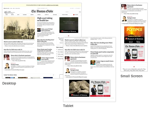
Boston Globe has incorporated an MMU ad unit. They’ve done this by fixing the width of that column and have the ad unit occupy that space as the viewport is reduced down to a single column.

Boston Globe screenshots on multiple devices
The good news is, this is a problem a few in the industry are seeing as an opportunity. ADO published a press release just last week:
to deliver cross-media web innovation, user experience design and integrated advertising for brand, agency and publisher clients specifically around mobile full-service responsive web design.
Matthew Snyder, CEO of ADObjects adds:
We wanted to share our vision on 11.11.11 since we believe a critical part of the right digital strategy is to build a cross-media mobile strategy with complete 1-to-1 parity multi-screen design. With one recent client we were able to see 4x more traffic and 30% of the traffic to mobile via responsive design methods due to search and social link matching over conventional mobile web platforms
If these numbers are to be believed, then there is a considerable ROI for advertisers to work to adopt responsive design and an ad strategy that would match.
Now, let’s get down to brass tacks. How would approach building out a complex responsive web site that had multiple slots?
The Standard Model
The existing model is based on advertiser filling slots, as shown in this diagram. Each is sold to perfectly fit an available slot. If none are sold, the website defaults down to a stand-in.

The standard model of displaying and selling ads for the web
A Responsive Model
Firstly, I’d sell slot ‘packages’ rather than single slots. This requires an ad sales team to clearly explain what those slots and sizes are, and they’d be served on that basis. For example, an advertiser would buy a package for slot A. The creative to deliver against that package would be a Leaderboard, an MMU and a small banner for small screen.

A proposed Responsive model of serving ads
Then, of course, the templates need to be able to detect the various widths and serve the correct ad based on that width.
Complex ads such as flyouts and takeovers would require much more thought and change. How could you effectively engage with an audience across the various viewport sizes when there is rich interaction involved?
As I mentioned, of course all of this is with a caveat that the advertiser is buying a slot ‘package’, rather than a single ad to fill a single slot. And that a sales team would sell it as such. This is the crucial difference, and for me, the biggest barrier to this change - it’s cultural and not technical, that requires a lot of explaining, and they always take the longest to do.
The template > slot > ad mental model is engrained both in advertisers, planners and web sites. Providing space for ads needs to be broadened into multiple spaces for one ad concept. This requires closer collaboration between advertisers and web sites, designers and marketeers and sales teams.
Over the past six months I’ve been working on this problem: speaking to sales teams, product owners, designers and as @kerns mentioned on Twitter this morning, the one thing that is plainly lacking at the moment is demand. I’d go one step further and say that the thing that’s missing is benefit. If the benefit can be clearly shown to advertisers and websites – in terms of an increase in penetration, reach, and ultimately, revenue, then we’ll start to see some movement.
I’d love to discuss this further on Twitter, or on Google +, you can reach me on either if you have any questions
Tags that this post has been filed under.