Five simple steps to better typography - Part 5
 The final part in this series, I’m glad to say is a little more cut and dry than the last in the series. It’s more about historical typographic theory but with a simple, practical guide to ensuring a balanced use of typeface weights.
Typeface weight, and the choice of weight, is perhaps one area of typography that to most designers is simply a matter of choice. That choice is dictated by answering a design problem which is aesthetically, or content, motivated. What many designers do not realise is that there are rules which should govern the choice of weight - a typographic pecking order - which when followed, aids the designer’s typesetting and can produce stunning results.
Solving the design problem
Let’s start by addressing the root of the decision to set type in different weights - solving a design problem. I mentioned that this problem stems from two main areas:
- An aesthetic problem. This is where the designer sets type differently to add style or solve some kind of visual or compositional issue.
- A content problem. The designer needs to set a different weight because the content dictates it. The language of the content may dictate special typographic treatment, the tone of voice may be different, it may be a quote, it may be a structural device such as folios.
There may be other reasons as well, but I believe these are the main cause.
First off a bit of history
I like these history bits, they really are informative. To research where the rules came from and why they should be followed goes a long way to ensuring they are used.
Uppercase and Lowercase, and the relationship between them, have been around for over twelve hundred years. Small Caps, ornamentals and arabic figures were early additions to the roman.
Italics were a strange bunch to begin with. They didn’t associate themselves with lower case roman, as we usually see today, but with roman caps and small caps. It’s only in recent times that usage of italic, within roman, was deemed to be typographically correct.
Some of the newest additions to the weights of typefaces came with bold, and condensed, as late as the early nineteenth centry. These were generally used in place of italics and small caps. Bold typefaces have now become a standard way of differenciating in typesetting, particularly on screen where italics are a little more difficult to read.
A type family with all of these weights forms a balanced series which is no only historically accurate but creates harmonious typography. If the setting of copy was reversed, so italics were used as body copy, Caps was used as pull-quotes and bold was used as access structure (folios, running heads etc) not only would the body of text look terrible, it was also be very difficult to read.
The practical bit
So, we have these weights of a typeface and they all relate to each other, and there’s a hierachy. How is this practical in everyday use?
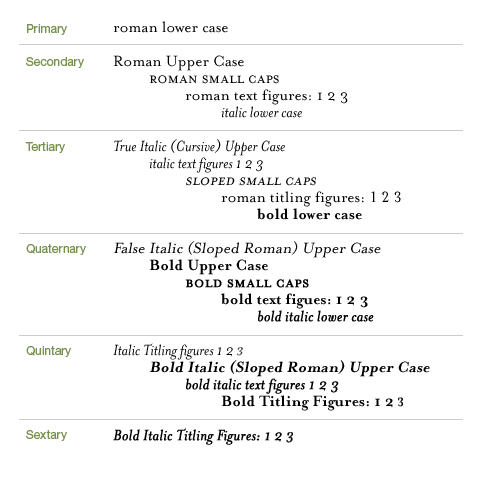
First off we need to show the different weights and how they are related to each other. Then we categorise them into a hierachical list, from primary to sextary. This is shown in the diagram below.

Execution of diagram inspired by Robert Bringhurst’s ‘Elements of Typographic Style’
This list, as it stands, may not be that useful. It does illustrate however the relative importance of certain typeface weights. It comes into practical use in the following diagram.

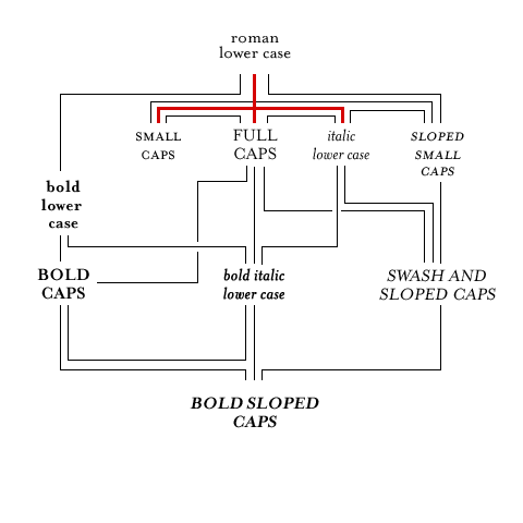
Execution of diagram inspired by Robert Bringhurst’s ‘Elements of Typographic Style’
Here you can see some of the weights set out and joined by lines. The red lines represent the core typeface family. Some typographers would argue that without these core weights, typefaces are reduced to being used for titles only. I’ll leave that one open for debate!
The other lines show how designers can move along the lines when setting type. for example, if a designer has set type in roman and they need to add emphasis to a certain point in the copy. They would follow the lines to any on the second line - bold lower case, small caps, full caps, italic lower case or sloped small caps. If they were to jump to, say, bold italic lower case, or a more extreme example, bold sloped caps, the effect would be horrible.
If the designer is setting type in bold lower case they could go on to add bold caps, or bold italic lower case without much bother. You get the idea?
So, following this simple roadmap can ensure that your typography adheres to some simple hierachical rules and as a result your typography will take on a harmonious feel. don’t just take my word for it though, set some type, use the rules and you’ll see.
A final word
I’ve enjoyed writing this series. What initially started as a quick five tips turned into something a little more involved and has sparked quite a lot of debate. I’m pleased it’s bringing traditional design stuff into the web standards realm, there really is so much more we can learn and put to good practice in this particular corner of the industry.
Typography is one of those things that has unfortunately suffered from the advent of technology (and i’m not just talking about computers here). Designers on the whole have divorced themselves from the letterforms and the setting of them. As a result they’ve forgotten, or not been made aware of, the simple typesetting rules which were core to the old system of printers apprentice.
Typography to me is about design. It’s about words and the conveying of meaning. It’s about setting words that people read. A certain amount of it is creative, a certain amount is expression and aesthetics, but mostly it’s about people reading stuff. Do them a favour and don’t make it difficult.
This is the fifth, and last, installment of this “Simple Steps…” series.
- Measure the measure
- Hanging punctuation
- Ligatures
- Typographic Hierarchy - size
- Typographic Hierarchy - weight
Tags that this post has been filed under.