Five simple steps to designing grid systems - Part 1
The first part of this Five Simple Steps series is taking some of the points discussed in the preface and putting it to practice.
Ratios are at the core of any well designed grid system. Sometimes those ratios are rational, such as 1:2 or 2:3, others are irrational such as the 1:1.414 (the proportion of A4). This first part is about how to combine those ratios to create simple, balanced grids which in turn will help you create harmonious compositions.
Starting with a blank canvas
It’s always easier in these kinds of tutorials to put the example in context, in some kind of real world scenario. So, this is it. You’ve got to design a programme for a gallery exhibition. You know you want the size to be A4. You also know that there are going to be photographs and text, and the photographs will be of varying size. There you have it - your blank canvas.
Subdividing ratios
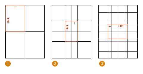
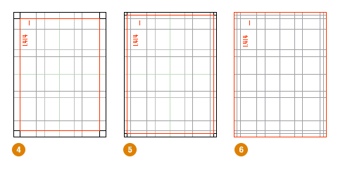
The grid system we are going to design is a simple symmetrical grid based on a continuous division of the paper size in the ratio 1:1414. Using the paper size as a guide we can retain the proportion throughout the grid, this will give our elements within the design a relationship to one another, the grid and the paper size.
This is one of the easiest ways to create a balanced grid. By using the size of the paper as a guide we can divide using that ratio to begin creating the grid. You can see this through diagrams 1 - 6 that we begin by simply layering division upon division to slowly build up the grid.


Diagrams kindly updated by Michael Spence
Getting creative
Many have said grid systems can stifle creativity, but I disagree. Grid systems can facilitate creativity by providing a framework and already answer some designers questions such as ‘where should the folios go’, ‘how wide should the measure be?’ etc. A well designed grid system will go some way to answer these questions and more.
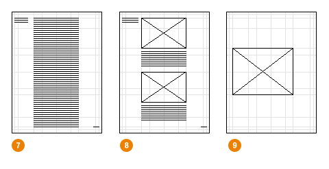
So, we have our grid. We can now begin to experiment with type areas, shapes and composition. We can explore how type and image will work together on the various types of pages our publication will have.

Diagram 7 shows the text area with the first elements of the access structure - running heads and folios. Diagrams 8 and 9 show how adaptable the grid is to various design options.
Short but sweet
A simple step to begin with. Next we’ll go onto to more complex ratios, such as the Golden Section, and combining multiple ratios across spreads instead of single pages.
The series
This is the first installment of this “Simple Steps…” series.
Tags that this post has been filed under.