Five simple steps to better typography

Typography, I find, is still a bit of mystery to a lot of designers. The kind of typography I’m talking about is not your typical “What font should I use” typography but rather your “knowing your hanging punctuation from your em-dash” typography. Call me a little bit purist but this bothers me.
So, in an attempt to spread the word here’s the first of five simple steps to better typography. To kick it off, part one is about the Measure.
Measure the Measure.

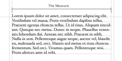
The Measure is the name given to the width of a body of type. There are several units of measurement used for defining the Measure’s width. The three basic units are:
- One point = 1/72 of an inch
- One pica = 12 points
- One em = The distance horizontally equal to the type size, in points, you are using. Eg. 1em of 12pt type is 12pt. (Thanks to Joe for correcting me on this.)
But, with the advent of DTP packages and the website design the following are also now used:
- Millimetres
- Pixels
There is an optimum width for a Measure and that is defined by the amount of characters are in the line. A general good rule of thumb is 2-3 alphabets in length, or 52-78 characters (including spaces). This is for legibility purposes. Keep your Measure within these guidelines and you should have no problem with legibility. Please note that this figure will vary widely with research, this is just the figure I use and it seems to work well as a generally rule of thumb.
CSS and fluid?
What is interesting here is fluid designs on the web. How can a Measure react to an increase and decrease in size. The entire grid would have to adapt to that change. An interesting discussion point and challenge.
The Measure and leading.
A simple rule is your leading should be wider than your word spacing. This is because when the balance is correct, your eye will move along the line instead of down the lines.
If your measure is wider than the guidelines for optimum legibility then increase the leading, or line-height as it’s sometimes wrongly called. This will have the effect of increasing legibility. Your leading should increase proportionally to your Measure. Small Measure, less leading. Wide Measure, more leading. It’s a simple but effective rule.
Reversing out?

When reversing colour out, eg white text on black, make sure you increase the leading, tracking and decrease your font-weight. This applies to all widths of Measure. White text on a black background is a higher contrast to the opposite, so the letterforms need to be wider apart, lighter in weight and have more space between the lines.
Tracking
![]()
The general rule of thumb in tracking your words (not the characters) is that the shorter the line length the tighter the tracking, the opposite is also true.
Your responsibility
Following these simple rules will ensure your bodies of text will be as legible as they can be. These rules come from a typographic craft background which unfortunately, for our industry in particular, aren’t being taught as much as they should be in the art schools around the world. As a result they aren’t being practiced and correct, well-considered typography is taking a nose-dive.
It’s our responsibility, as designers, to embrace the rules which are born of a craft which goes back hundreds of years.
Hopefully, this series of quick, sure-fire ways of improving your typographic craft will help in some way make sure computers and DTP doesn’t kill it off. That would be a great shame.
The series
This is the first installment of this “Simple Steps…” series. Next up we have Hanging punctuation
- Measure the measure
- Hanging punctuation
- Ligatures
- Typographic Hierarchy - size
- Typographic Hierarchy - weight
Tags that this post has been filed under.